

Experience Management evaluation guide for desktop devices
Introduction
New software can be exciting and/or overwhelming. The trick is to think of all the value that can be gained from a new software tool without becoming overwhelmed by too many features that may or may not ever be used for an environment or use case. Omnissa Intelligence is powerful software that aggregates telemetry from Workspace ONE UEM and Horizon deployments and correlates that data to present insights, make recommendations, and provide visibility across an environment.
With the Experience Management add-on, there is a lot of telemetry and data to dig through. This guide will walk through the first few weeks of a new deployment to highlight the easy ways to see ROI. Discussed will be seven examples from the first week, second week, third week, and then some features that will typically come into play after one understands the software a bit better and is comfortable with most features it offers. All the use cases in this evaluation guide will be based on real examples that pertain to desktop devices.
For a better overall understanding of Experience Management, check out the following resources:
Getting Started with Workspace ONE Experience Management
Omnissa Workspace ONE Experience Management
These documents will walk through the basics of the product and explain the different features and terminology that are included in Experience Management.
Week 1: Realizing quick ROI
Now that Experience Management is enabled in the tenant, what’s next? Let’s dive right into the first example to start realizing some value.
Use case 1: Using Insights to view software adoption and send an Intelligent Hub Notification to users
When deploying new software to organizations, often management teams want to make sure that adoption is taking place since money has been spent. One easy way to capture this metric is by using Insights within the Experience Management toolset. This use case is based on an organization that was moving from Microsoft Teams to Slack as the company’s communication tool. The leadership team wanted to see that the Slack app was used during the first week of deployment. Admins were able to use Insights to help show data around this inquiry.
Under Experience Management, the admin clicked on Insights. On the top left, they used the search icon to find insights related to “Slack.” One result came back with the insight named “Slack.app usage increased,” which is gathered by count of app foreground events. This data metric used for the insight is listed in the Timeline widget in the bottom right corner.
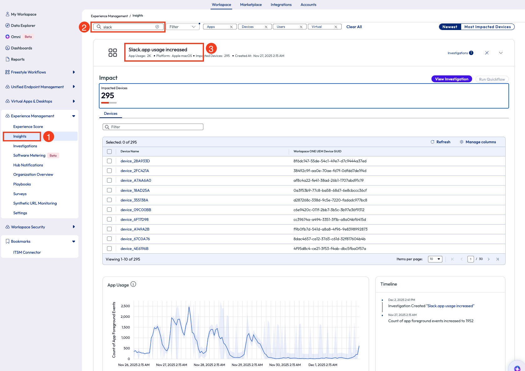
Figure 1: Most impacted devices listed on the Insights page
The admin dug deeper into this insight by clicking the arrow out to the right side. For this “app usage increase” insight, displayed is the count of impacted devices, a list of these devices, app usage on a chart and a timeline of events.
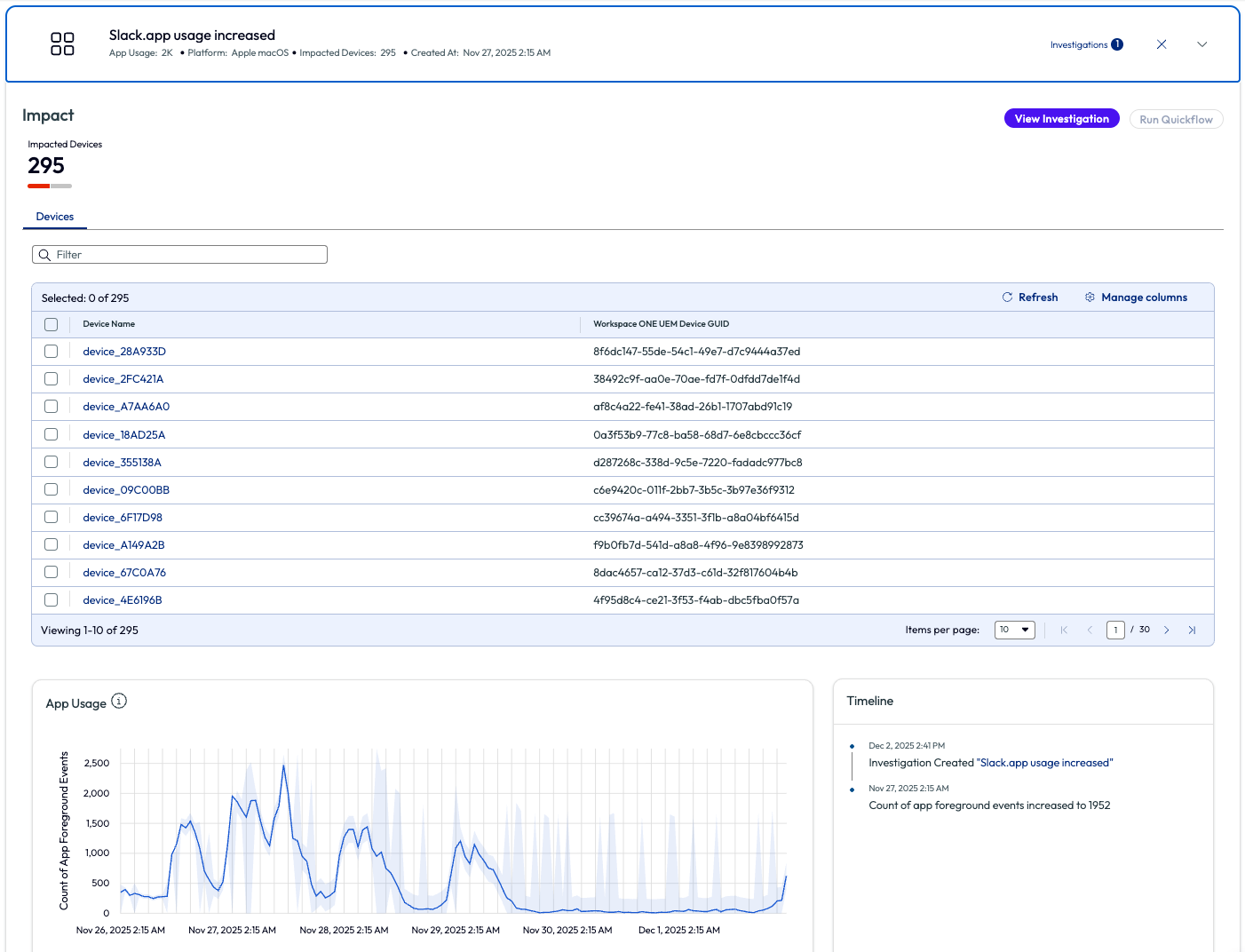
Figure 2: Overview screen for Slack.app usage increased insight
An investigation can be started directly from this page in which actions can be taken on these devices. These actions are called Quickflows and more information can be found here: Omnissa Intelligence Quickflows. For example, if there had been latency, hangs, or crashes detected with an increase of usage for the Slack app, then a script to clear cache on these devices could be deployed. However, for this use case the admin simply needed to improve the adoption rate and report back to the leadership team about their findings. The admin decided to send a quick Intelligent Hub Notification to users who have adopted the Slack application within the first week with a quick ‘Thank You’ message.
There are many other options to take action, as seen below, by checking one or more devices from the list and clicking Run Quickflow in the top right corner. For example, create a ticket for an integrated ITSM tool, send an email or instant message to support teams, tag devices and more from this menu.
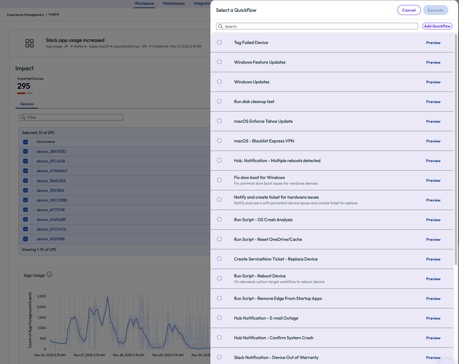
Figure 3: Quickflow options to run against selected devices from the Insight
If the desired Quickflow doesn’t exist, as in this use case, then a new one can be created by clicking “Add Quickflow” in the top right corner. The admin is taken to the workflow screen with a list of available connectors and chooses Workspace ONE Hub Service from the list.
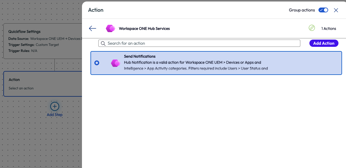
Figure 4: Freestyle Workflow step to add an action, in this screenshot it is an action to send a Hub Notification to users
After selecting to send a notification, the admin clicks “Add Action” in the top right. There are multiple required fields that need to be completed, but one important step for this use case is to change the type to “Informational” instead of “Actionable.” Just as it sounds, this makes the notification display as just information versus displaying a notification that requires some type of action to be taken by the end user.
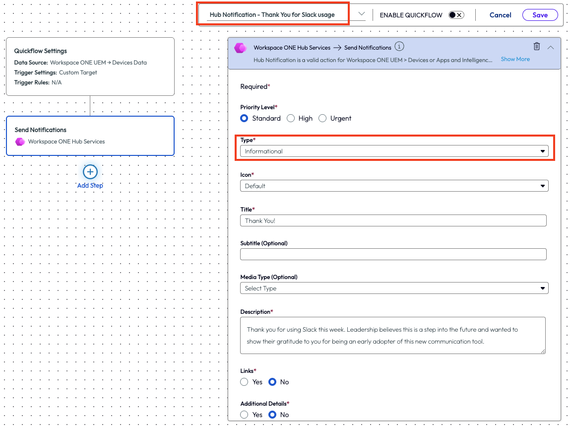
Figure 5: Filling out a Hub Notification and highlighting a couple of the required fields
The admin created the notification with a simple thank you message and only sent it to users that had the Slack app in the foreground over the previous 7 days. This may seem like a simple task, but it’s just an easy walk through example of how the tool can be used within the first week of deployment. In this use case, the admin continued to keep an eye on adoption and report back to leadership but was grateful for this quick and easy way to act on the data found.
While this example was used to investigate software adoption, the Insights, Quickflows, and Investigations options are ample. Consider this use case as a fast way to start investigating events that are reported on the Insights page.
Use case 2: Creating a report for Dell devices within 30 days of warranty
Another use case demonstrates a way to help with asset management using a pre-built dashboard that can be added from the Marketplace. This example looks at Dell devices that will be out of warranty within the next 30 days so that admins can formulate a plan on how to address these devices before they become noncompliant. Security, compliance, and performance of devices are all addressed by raising awareness and taking action on warranty date of devices in an estate. Admins have a lot to track on a daily basis, and this use case is just one of the many aspects of an environment hygiene.
Note that the Dell connector must be set up as an integration for this use case. Use the following documentation guide for further set up instructions - Dell TechDirect Integration.
At the top of the page there is a tab named Marketplace, which is the library of pre-built resources available in the product. More of this will be covered in subsequent use cases in this article. This particular use case is started by clicking on the Marketplace tab, then by scrolling down the page there will be a list of templates sorted by category. These include Dashboard, Widgets, Reports, Scripts, Sensors, and UEM Workflows. All of these have been pre-built by Omnissa and cover a myriad of metrics and actions that can be taken.
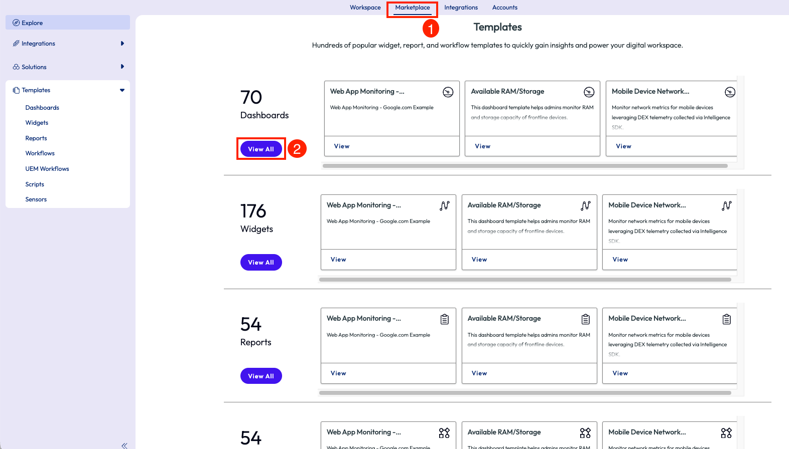
Figure 6: Templates page inside the Marketplace that shows different categories of out-of-the-box resources
By clicking on View All for the Dashboards category, the page will display a list of out-of-the-box (OOTB) dashboards available. Below the Featured Template widget, the list of these dashboards is seen, and in the top left corner is a search icon. Using this icon and searching for “Warranty” will bring back related results. This list is narrowed to a dashboard named “Dell Tech Direct Warranty Information.”
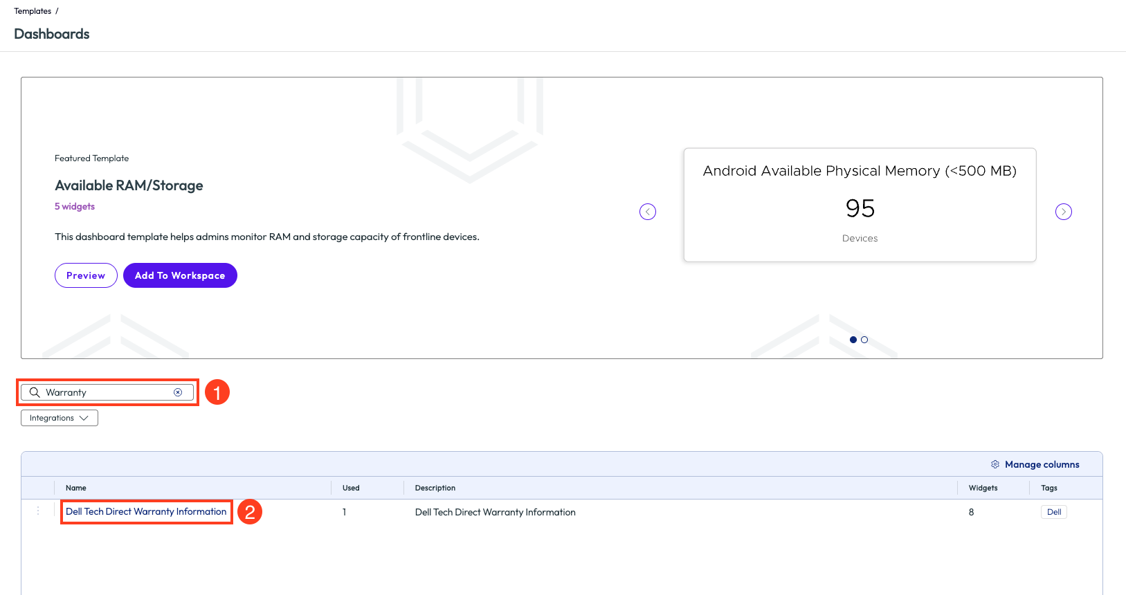
Figure 7: Search screen for dashboard templates with ‘warranty’ included in the name
After clicking into the dashboard, a preview screen is shown. From this screen, clicking on the arrows to the sides of the main widget will display a preview of how this dashboard will present specific data metrics. The bottom left of the page will list the count of widgets on this specific dashboard. After verifying these widgets will fit the needs of this use case, clicking “Add to Workspace” will automatically apply this dashboard to the environment.
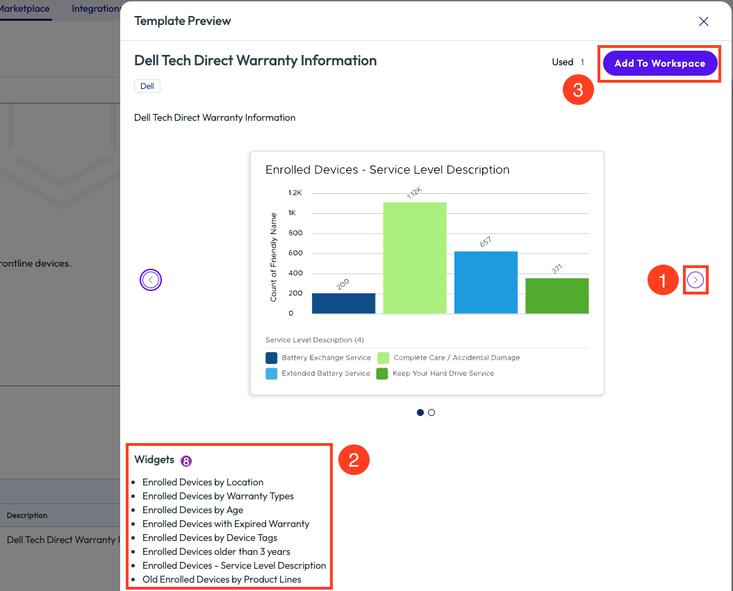
Figure 8: Preview screen of dashboard template with list of included widgets, Add to Workspace button will apply this Dashboard to the tenant
On the pop-up window, there is a required field to name the dashboard, however it is pre-populated with Dell Tech Direct Warranty Information. Note here that duplicate names cannot be used in the tenant. If another admin has already added this dashboard, then a notice will be displayed for a duplicate. Once properly named, using the Add option will add the dashboard to the tenant but leave the admin in the Marketplace; using the Add & Go To Workspace will add the dashboard but immediately redirect to that dashboard inside the Workspace section of the tool.
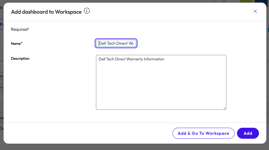
Figure 9: Naming and adding a Marketplace dashboard to an environment
Now that the dashboard has been added, the admin can start to explore and analyze the data to draw conclusions and take action. The dashboard includes multiple widgets related to Dell devices, age, warranty, age of warranty, location, device tags, count and description of warranty services, and old devices broken down by model.
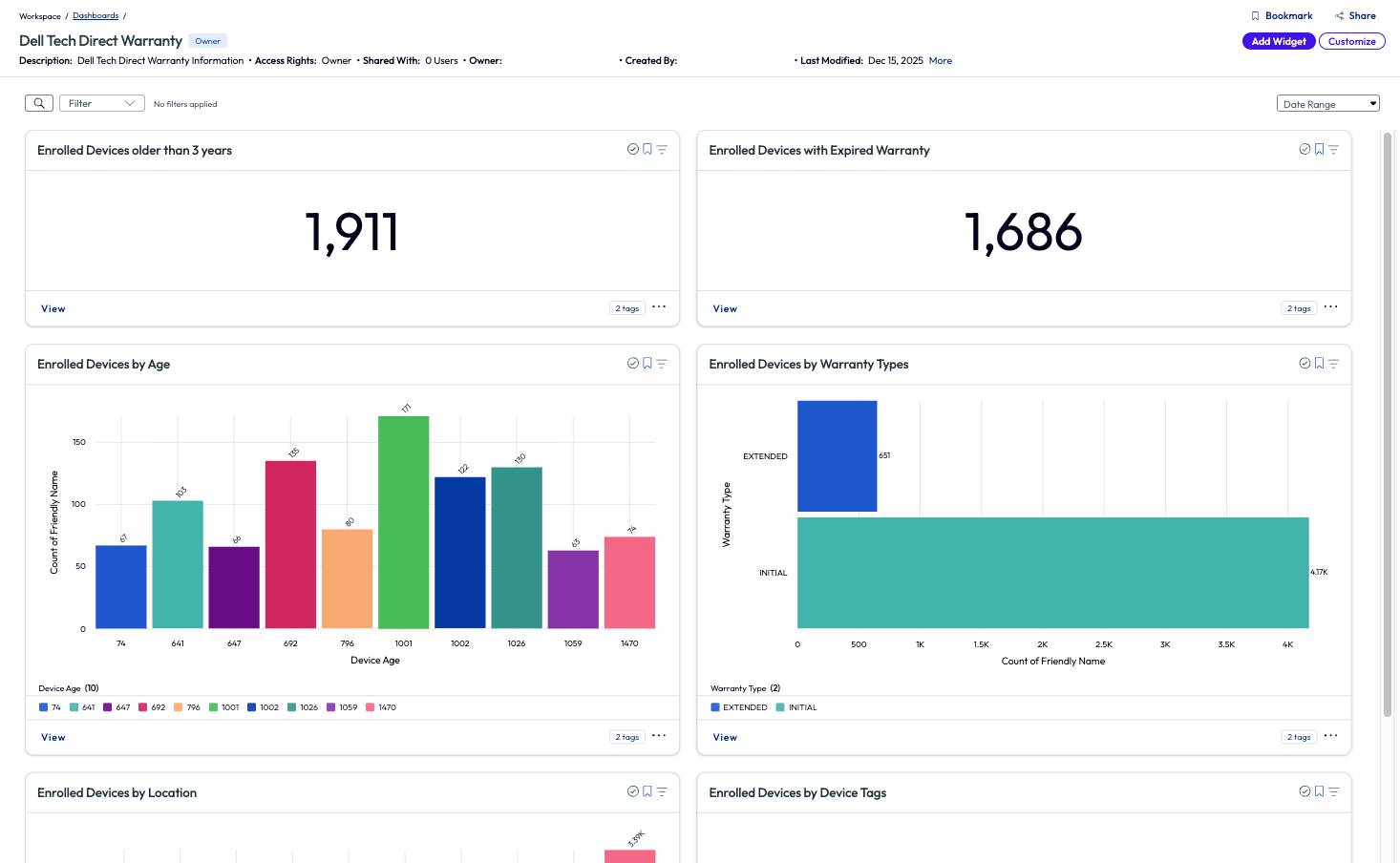
Figure 10: Dell Tech Direct Warranty Information dashboard
Since the environment in this example has just recently deployed Workspace ONE UEM and Omnissa Intelligence, the admin immediately notices a very large percentage, 88% in fact, of Dell devices that are enrolled but have an expired warranty. This is an alarming number, and the admin makes this a top priority to remedy. Clicking into the widget for this metric retrieves a list of all 1,686 devices that need to be addressed. The admin decides to sort the list by Warranty End Date to have the support team start addressing these in batches. Other available Quickflows include sending messages to users or creating alerts to notify when devices become out of warranty moving forward. This notification directly helps with estate hygiene and promotes instant ROI.
At the top right of the page, the list is easily compiled by using the Report option. The left panel is where the parameters for the report are set, while on the right side is a preview of the report itself. Using the Manage Columns option allows for essential metrics to be included or excluded from the report. After saving the report, the report is built, which can take various times depending on the size of the report, and an email is sent to the admin once completed. From there the report can be shared with a link or downloaded.
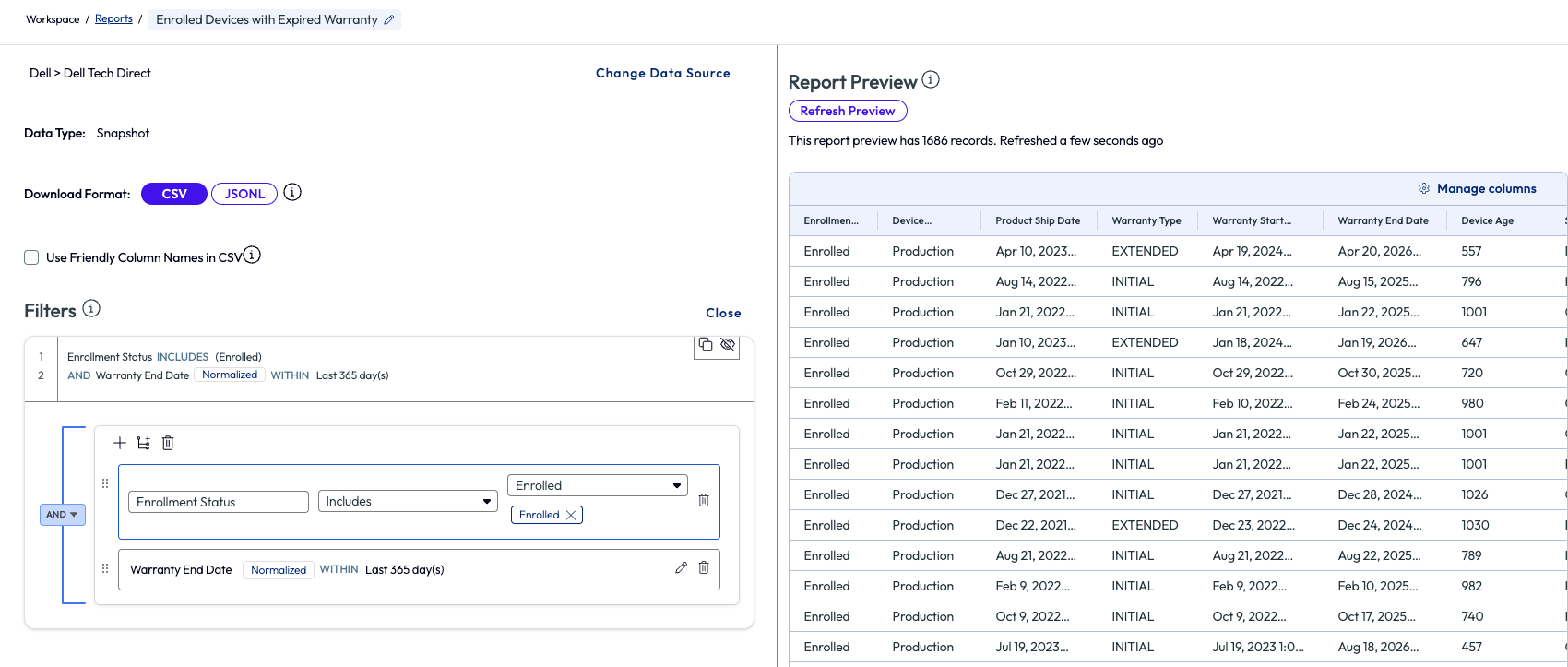
Figure 11: Widget from Dashboard is turned into a report and exported
Here is where the real value comes in for this use case – time and effort saved. At the start, the admin didn’t have a list of these devices readily available. This report typically is created by an admin of an organization reaching out to their Dell service rep and having it compiled on the vendor side. This can take time and effort of emailing, downloading, and waiting on reports to be sent over, which is obviously out of the admin’s control. However, using the built-in dashboard, an admin can compile the report internally within minutes and have it sent to support teams with an actionable plan for remedy.
Many resources and dashboards are available within the Marketplace, but this one specific example shows the power of insight that can be gained from resources within the Marketplace. Exploring the Marketplace is a quick way to begin using Omnissa Intelligence because the heavy lifting of building dashboards, widgets, scripts, sensors, and other resources is ready OOTB.
Use case 3: Restart failed critical services
As an admin, one item that needs to be monitored daily is the failure or critical services. Losing a critical service can cause loss of time and money and can cripple entire teams or organizations depending on the severity of the failure. Just like in Use Case 2 above, the admin in this example searched the Marketplace for a pre-built dashboard to help monitor critical services on devices. By searching Dashboards in the Marketplace for “proactive,” the results display two options. The second option is named “DEX Getting Started – Proactive Maintenance 2” and includes widgets that provide insights around failed services and hardware.
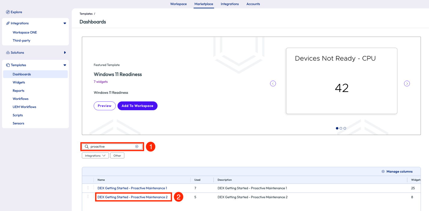
Figure 12: Search results for “proactive” in the Dashboards section of the Marketplace
One of the widgets included, named “Windows - Total Services Stopping Events by Service Name,” shows a list of services sorted by count of stopped events for services. The admin noticed that WMI Performance Adapter tops the list with 3,266 failures. This service is considered a critical Windows service for the organization in this example, so the admin decided to dive deeper.
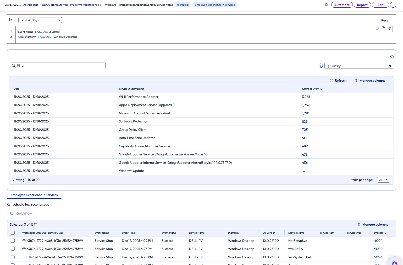
Figure 13: Widget showing failed services sorted by count of failures
After clicking on the count value for WMI Performance Adapter, the list filtered devices with this specific failure and listed them below. From here, the admin can take action to remedy these devices by selecting all devices and running a Quickflow, or Automate with a workflow, or create a Report on these devices. In the first two options, a signed script can be pushed to the devices to restart this specific service. The admin decided to create a report of these devices with this failure and send it to their team to start investigating a root cause.
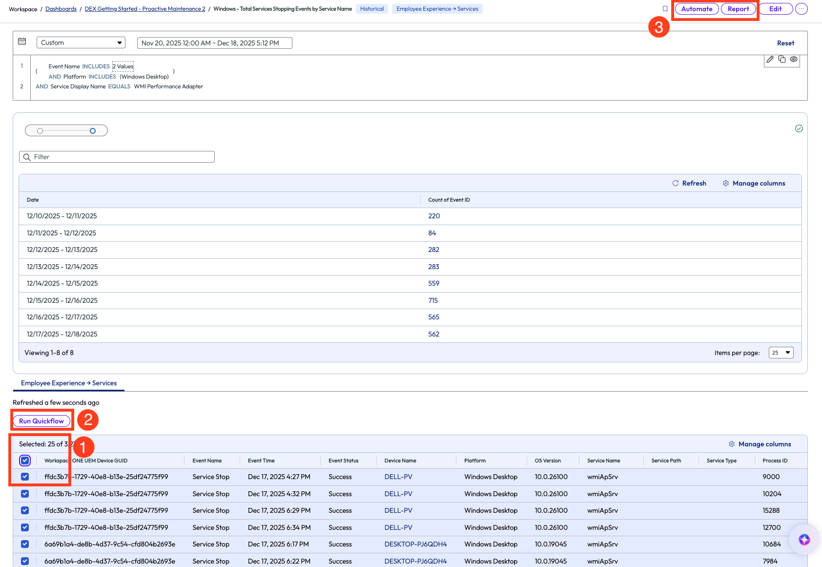
Figure 14: Selected devices and options of actionable steps
The support team used a customer signed script that restarts the WMI Performance Adapter service and created a workflow that applies this script to the devices on this list. Automated workflows will be covered more in following use cases of this article.
This use case helped the admin find an issue they were originally unaware of, but within a few minutes they had a complete list of impacted devices. Targeting the impacted devices with a specific script helped save time and showed how organizations can use this tool to reduce the MTTR in a tangible way. Also, now that the team has this script uploaded into Workspace ONE UEM, it is now a reusable resource that can be deployed as needed to devices.
Use case 4: Identify applications with poor experience score and see impact by version
Keeping apps up to date and on the best working version is a protocol that all IT teams in all industries should follow because it impacts the experience of the end user and directly impacts security of enterprise devices. An admin can get quick insight around app performance by using the Experience Score feature. In the screenshot below, the Experience Score page shows aggregated metrics related to the organization’s current user, device, and app experience. To learn more about how these scores are calculated, check out Experience Scores and their advantages.
Admins can jump into more details about these metrics by clicking into a category on the left pane, which includes Devices, Desktop Apps, Mobile Apps, Users, and App Integrations.
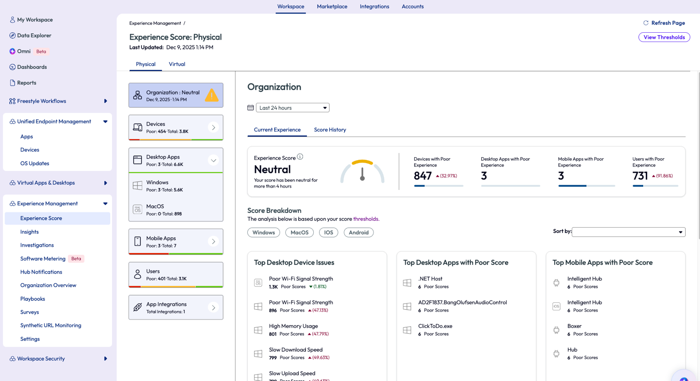
Figure 15: Experience Score page for the organization
By clicking on the Windows category of the Desktop Apps on the left pane, the display will show a summary of all apps on Windows devices and how they are performing. These metrics are based on a 7-day rolling timeframe. This timeframe can be changed to other ranges, for instance 28 days, to see if the crash is a one-time anomaly or if it’s a continuous issue. To see the apps with poor performance, the admin simply selects the quick filter on the top right of the list. Next, customize the list even further by sorting the column named Total App Crash Count.
The top App Crash Count in this example is ClickToDo.exe and this app has crashed approximately 9.8k times in the past 7 days. One valuable insight that can help determine if a problem is widespread or specific to a limited number of devices is the Impact column on this list, hover over it to see a breakdown of devices impacted.
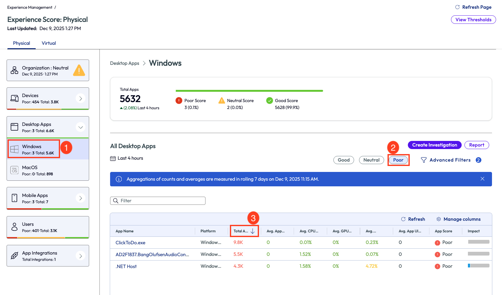
Figure 16: Apps with poor experience score, sorted by Total App Crash Count in descending order
After clicking into the ClickToDo.exe app, the data can once again be sorted by the listed columns. Sorted below by Average App Crashes, the only app that shows crashes is version 2521.26801.0.0.
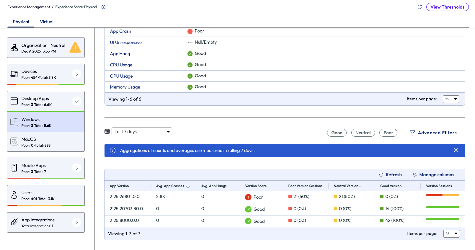
Figure 17: Experience score for the ClickToDo.exe app in a tenant, sorted by App Version number
Now that the issue has been correlated with a specific version, action can now be taken by deploying a newer or more stable version to devices. This particular version can also be removed from devices to prevent further crashes. There are many options available using the Quickflow menu in the top right that will help remedy issues like these.
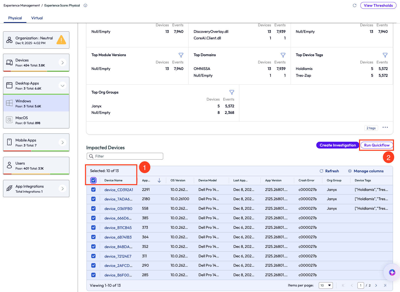
Figure 18: Devices impacted by ClickToDo.exe crashes
Sometimes admins may need to dig a bit deeper to find the root cause to remedy it. Note in Figure 18 there is a column named “Crash Error,” which is the error code captured by the device for the specific crash. Admins can use this error code to research further online and find more information about this specific code in reference to this application. Using this research can provide more insight to root causes and help teams remedy issues properly and efficiently.
This use case outlines how to quickly identify poor experience by highlighting versions of applications that are having issues, including app crashes, hangs, UI unresponsiveness, or hardware usage spikes. The ability to quickly remedy out-of-date apps significantly impacts the security posture of the entire environment.
Use case 5: Disk Cleanup on devices with low disk space using a script
This next use case walks through a quick way to improve device hygiene across the environment. When the nature of a business is to download files and not live as much in the cloud storage space, then old and temporary files build up over time on devices. This excess storage can slow down devices and increase time to complete even the simplest tasks. In this example, an admin likes to keep good device hygiene by regularly running Disk Cleanup on their Windows devices. Since this task is not scalable manually, the admin uses a script found in the Omnissa Intelligence Marketplace to make the job almost instant. Inside the Marketplace, the admin uses the Scripts section to locate a useful resource for this need, conveniently named Disk Cleanup.
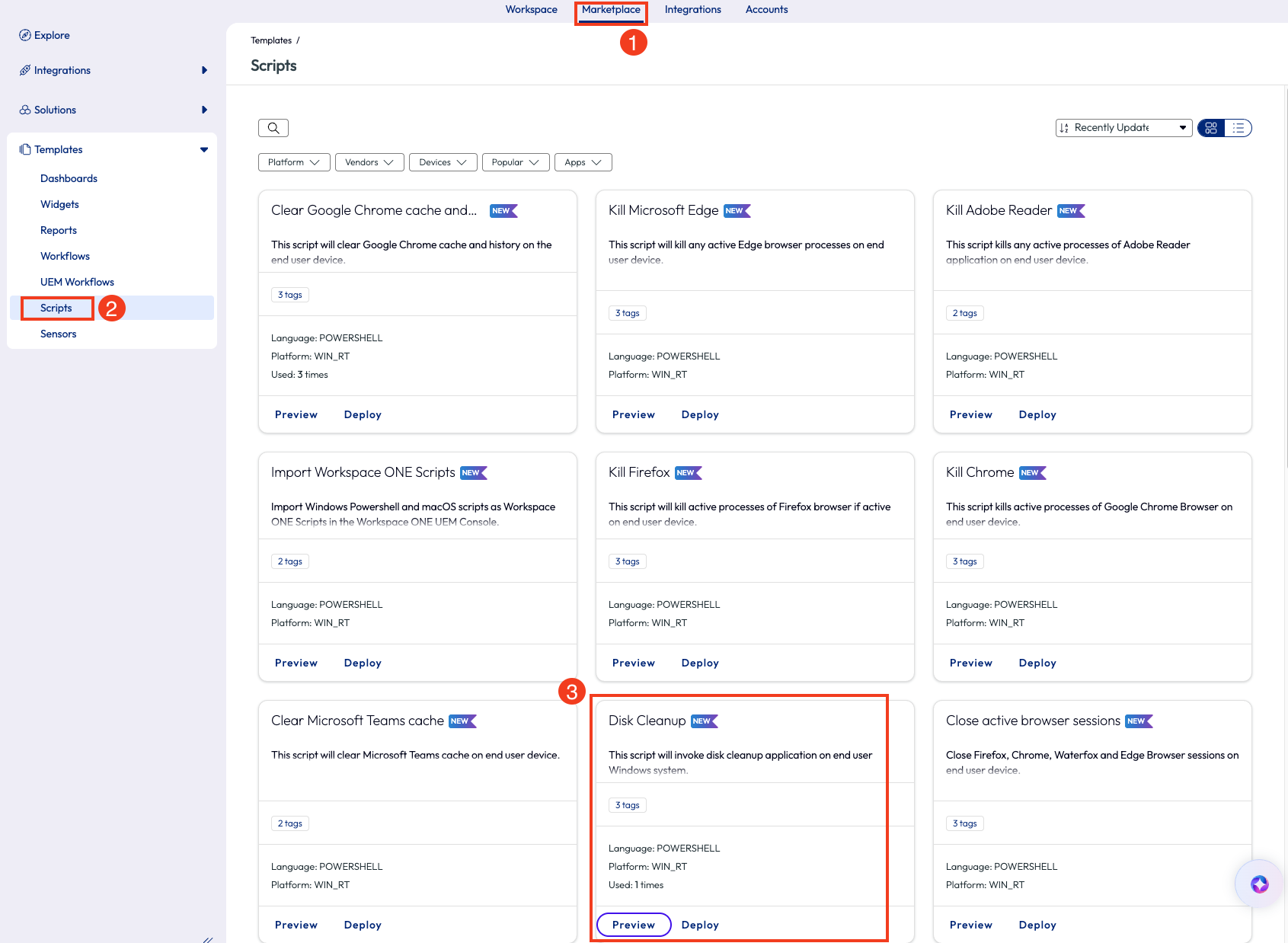
Figure 19: Finding Disk Cleanup script inside the Marketplace
Clicking Preview on the script pops open a window with more details and the option to preview the code or download the script locally, which is a good practice for initial testing before deploying to an environment.
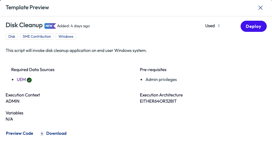
Figure 20: Preview of the Disk Cleanup script in the Marketplace
After the admin has previewed the code and tested locally, they are ready to deploy to their environment. After clicking Deploy in the top right corner, the pop-up screen provides one more chance to review and displays an informational warning for using scripts. Clicking the Deploy option here opens a new tab of Workspace ONE UEM with the script ready for final review before it is added to the UEM environment.
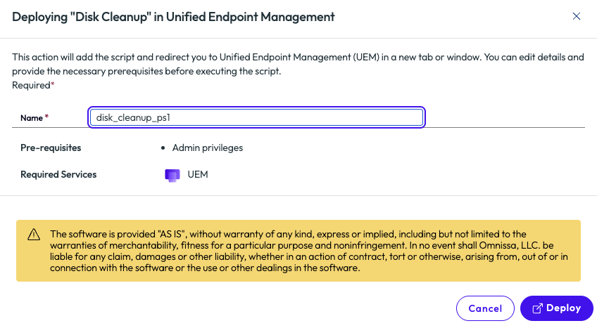
Figure 21: Deployment screen for the Disk Cleanup script from the Marketplace
While the script will be deployed to the environment using Workspace ONE UEM, the admin is relieved that it was pre-built, rather than creating the script from scratch. Excited by this, the admin went straight back to the Marketplace to browse other time-saving scripts available.
Important to note here that once the script has been added to the environment and is available in Workspace ONE UEM, it can then be used inside the Omnissa Intelligence Workflows tool. It can be added to any workflow as an Action component as in the below figure. For more information, check out these documents:
- Automate Endpoint Configurations with Scripts
- Automate Endpoint Configurations with Scripts for macOS Devices
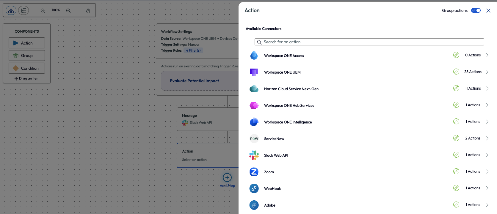
Figure 22: Adding an action component inside the Freestyle Workflows tool of Omnissa Intelligence
After selecting the Run Script option for this action, the Organization Name must be chosen. The Script Name drop down will now allow for selection of all scripts available from the Workspace ONE UEM environment. To learn more about Freestyle Orchestrator inside Omnissa Intelligence, check out this walk-through: Intelligence Dashboards Workflows and Reports.
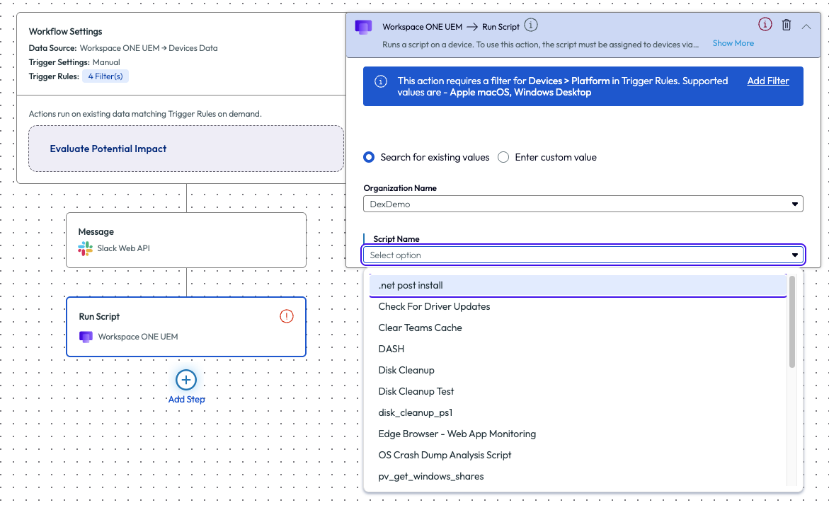
Figure 23: Adding a script to a workflow action inside the Freestyle Workflows tool
The process of finding a script in the Marketplace that is focused on disk cleanup is beneficial for periodic hygiene of devices or environments. Other use cases can include clearing cache, closing programs, updating group policies, clearing DNS cache and more. It is obvious to see how these pre-built, OOTB resources can save admins time and effort, which results in clear ROI.
Use case 6: Using Software Metering to identify non-compliant software and investigate remedy options
With so many software products in existence it can be hard to track what apps are used or not used by users across an enterprise. Omnissa has simplified this challenge with a feature named Software Metering, which provides a built-in dashboard that monitors usage metrics on software installed on devices. This feature is found on the left pane, inside the Experience Management section of the product, and includes four tabs along the top – Portfolio, Discover, Optimize, and Compare. This can be used to help reduce costs in unused software, ensure proper license assignments, identifying non-compliant software on enterprise devices and much more. In this use case we will show a quick way to identify non-compliant software in an environment and how to remedy it.
Within the Software Metering tool there is a lot of information available. One way to identify what type of software might not belong in an enterprise environment is to use the columns on the list at the bottom of the page.
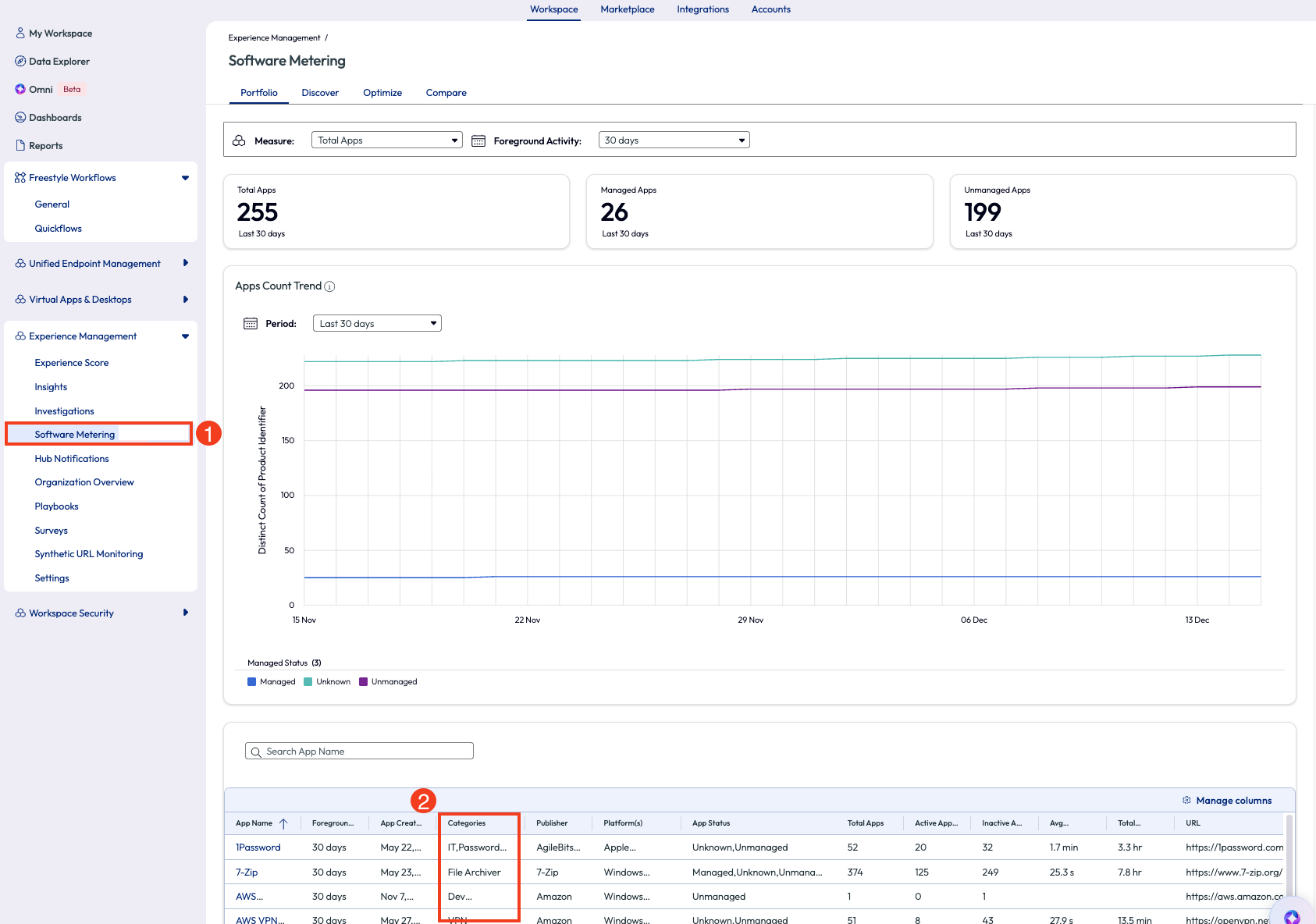
Figure 24: Software metering page, highlighting how to sort by category
Sorting this by Categories in descending order will reveal something that doesn’t belong: applications categorized as “video game.”
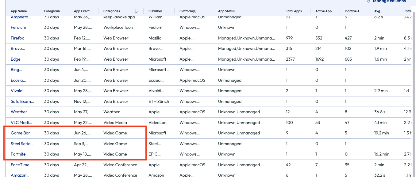
Figure 25: List of software sorted in descending order by category
The admin knows that Fortnite should not be installed on any enterprise devices and clicks on this application to find out more. Thankfully, this game is only installed on one device, and that device is identified. Now the admin can address this directly with another team by creating and sharing a report in the top right corner, or by clicking the Automate button that puts this software into a Workflow that is built with this application in the parameters already.
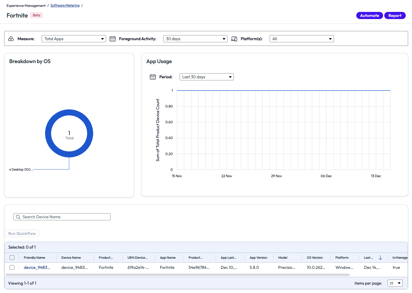
Figure 26: Software Metering page for the application named Fortnite
If the software is an internal application or a public application that is managed by Workspace ONE UEM, then it can be removed directly with one of these actions in the workflow.
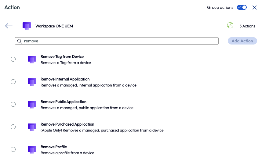
Figure 27: Available actions in Freestyle Workflows when searching for “remove”
If the application is unmanaged, as in this example, the admin can choose to create a ticket to be used to track resolution of this policy violation.
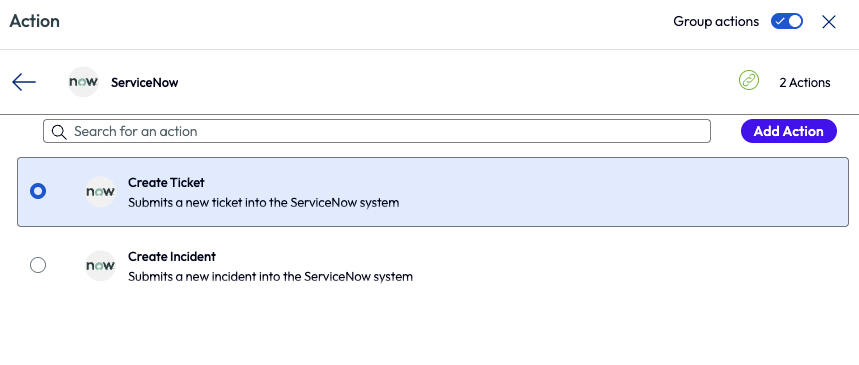
Figure 28: ServiceNow action options inside Freestyle Workflows
Other examples of Software Metering include reclaiming unused licenses, reclaiming licenses for low usage, software justification, and more. This tool is not only a quick way to realize ROI in a tangible way, but as seen in this use case, Software Metering can help keep enterprise environments safe from malicious or unwanted software applications.
Use case 7: Building custom widgets - what’s important to individual organizations?
Different industries care about different metrics across their environments, so the ability to customize data accordingly is of key importance. Some organizations don’t care how long it takes devices on average to shut down, but there are some that might. This granularity can be used to zoom in on what’s important. This guide has covered how to use OOTB resources, but this next example will walk through the need for a custom widget to get insight into older Dell devices in the organization. This information helped this organization’s IT team target these devices for refresh.
Using the Data Explorer tool, the admin selected the Dell data source and selected the subcategory of Dell Tech Direct.
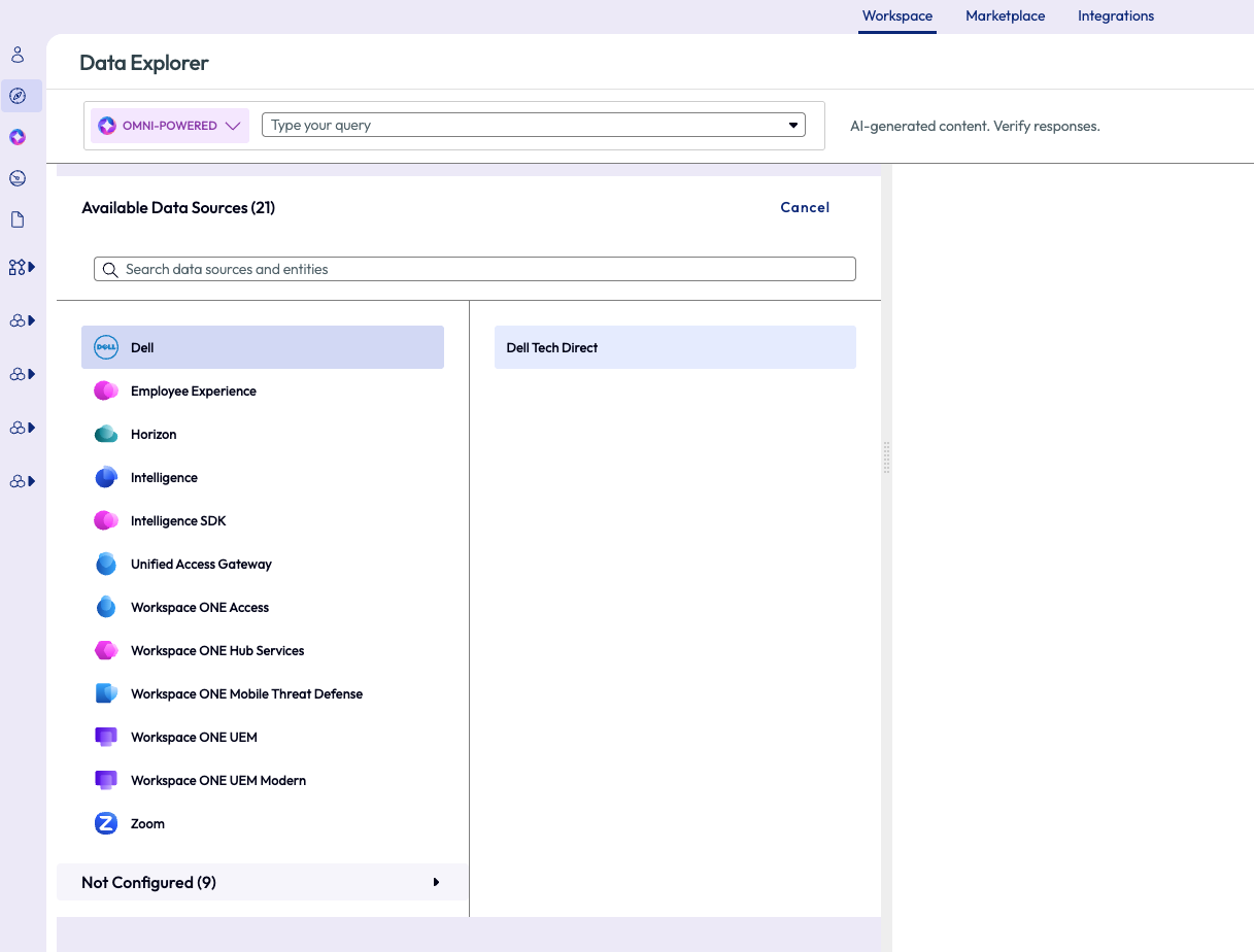
Figure 29: Data Explorer feature used to select data sources
On the filters page, the admin selected Enrollment Status attribute, set the operator to Includes and for the value selected Enrolled. This step filtered all the devices in the organization to only ‘enrolled’ devices to remove any old devices that are no longer active but may still have had a record in the Workspace ONE UEM console.
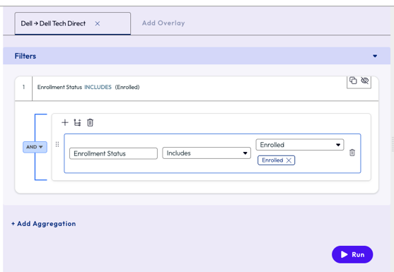
Figure 30: Filters set to display only enrolled devices
To narrow down even further, the admin selected the following parameters for the aggregation: Count of Workspace ONE UEM Device GUID, grouped by Device Age and sorts the results per group size of 10. To zoom in on these specific devices and sort them in groups by age to see the oldest ones in the environment, the admin clicked the Run button.
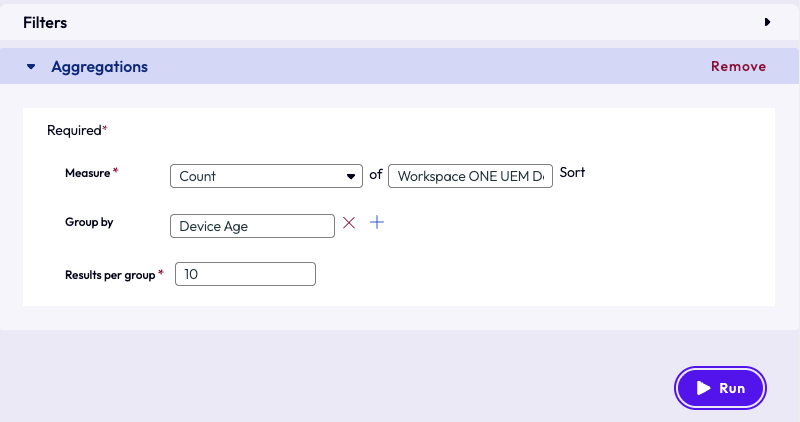
Figure 31: Aggregation options required for resource creation
The results are displayed on the right pane in a donut chart. The admin was immediately directed to the oldest age by noticing the highest number on the chart – 1470. This batch of devices was just over 4 years old, but the company policy is 3 years for device refreshes.
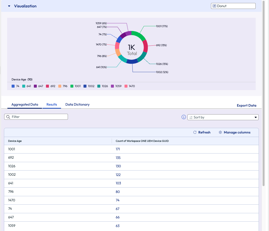
Figure 32: Results displaced from the filters and aggregation
The admin saw the value of this widget and wanted to save it to a dashboard for viewing in the future. Omnissa has made this task easy by offering a button in the top right of the page – Create. From this menu, the admin decided to create this new widget and add it to an existing dashboard.
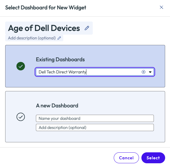
Figure 33: Option to save to an existing or new Dashboard, name is required
Moving forward, any time the admin or other IT team members need to work on device refreshes, or just see a count of where the environment stands, they can reference this simple widget for quick insight. Using the list of devices from this chart, the admin can select devices to take action, such as creating tickets, emails, instant messages, or tagging of devices.
Looking through the various data sources from the first step of this example shows the depth and breadth that Omnissa Intelligence provides. The Data Explorer is a great starting point for building custom widgets, dashboards, and reports.
Week 1 Wrap up
This section has covered some low hanging fruit that will boost confidence for any admin new to the Experience Management module of Omnissa Intelligence. With these easy-to-get-started use cases, realizing ROI within the first week is a reality.
Week 2: Diving in for more
With one week under the belt, it’s time to dive in and see a little more about what Omnissa Intelligence can do. Discussed in this section are seven more use cases to exemplify the power behind the Experience Management features. These examples show a deeper look into the product and what type of value should be expected when diving into the second week after deployment.
Many OOTB widgets and dashboards are based on a 7-day rolling period. Of course this can be edited, but by the second week of rolling out Experience Management to an environment there will be more data points collected and available for exploring.
Use case 1: Horizon poor session experience with high average memory usage
Not all things are under an admin’s control, but that doesn’t mean the Experience Management tool can’t be helpful to the organization. Looking at the bigger picture and narrowing down the root cause for other teams can be beneficial to those teams and the company, as will be discussed in this example.
The admin in this use case wanted to see the big picture of how the organization as a whole was performing. They clicked on the Organization Overview option from the left pane and was led to a grouping of pre-built widgets. This overview dashboard shows the experience from a high level so admins can understand at a quick glance. The first thing that stood out was the Virtual Session Experience for the organization had a poor score.
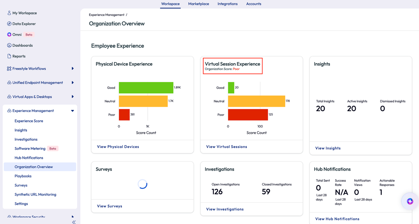
Figure 34: Organization Overview OOTB dashboard
The admin clicked on View Virtual Sessions on the widget to investigate a step further. On this next page, the admin immediately knew the experience was poor, not just because of the score but because the consistency of the red in the charts of the widgets. Over the last 4 hours the score was poor, as seen in the first widget with the gauge, but more importantly is that on the 7-day rolling average the poor score had been persistent.
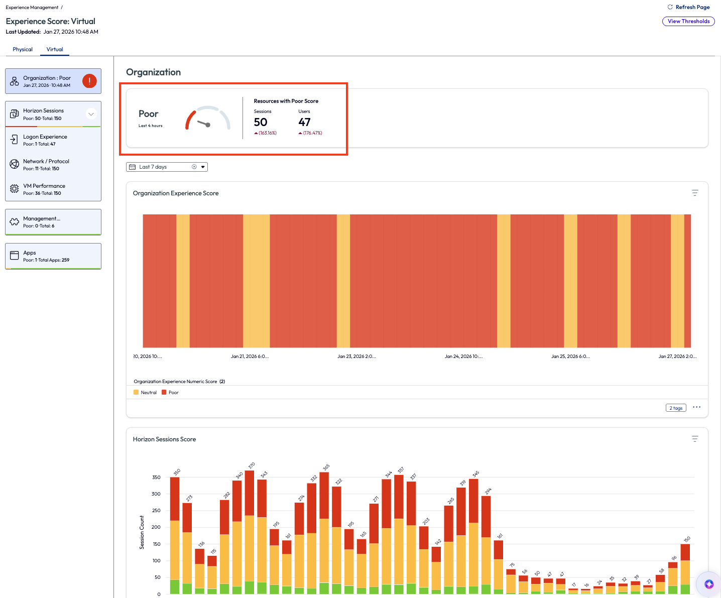
Figure 35: Experience Score for virtual machines
On the left pane again, the admin clicked on the VM Performance option to try and figure out the root cause of the poor score. This page lists the contributors to the poor score in descending order. Although not the highest reason, the admin decided to look into the Memory Usage contributor as it has been an issue in the past for their organization.
Note: In the next few screenshots, the ability to view the thresholds for different experience scores is available by clicking on View Thresholds on the top right. Clicking on an individual widget for an experience score will allow adjustments to be made.
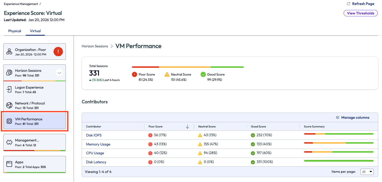
Figure 36: VM Performance dashboard that shows a list of contributors for the experience score
In Figure 4 the session count of average memory consumption score was displayed, broken into 4-hour intervals over the previous 24 hours. The admin looked to the list at the bottom of the page to see top sessions with high average memory usage listed, again, in descending order. This helps identify the most impacted users first so they can be investigated and addressed the soonest.
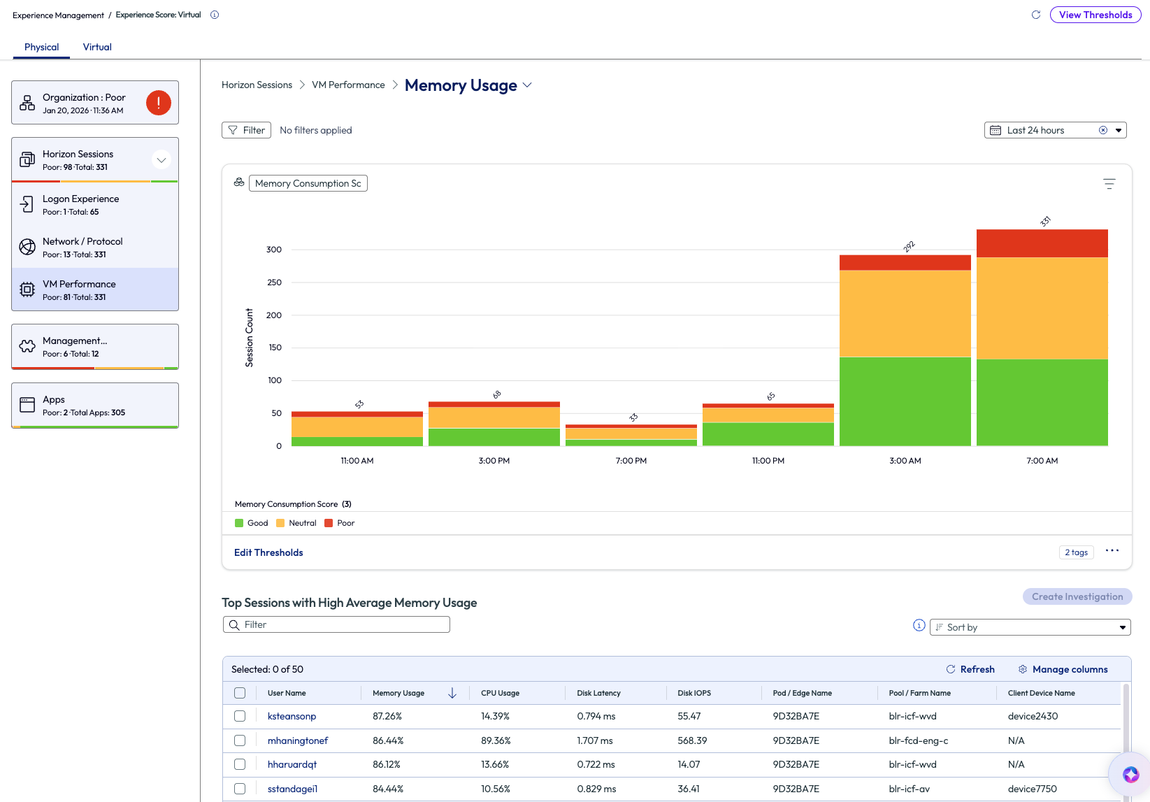
Figure 37: Memory usage for VM Performance over the past 7 days
Next, the admin clicked into the top user name on the list, ksteansonp. Details around this session opened and it was obvious that memory was consistently running at almost full capacity at around 94%. This high usage was not only bad for the user experience, but also bad for the server hardware when at this constant high usage.
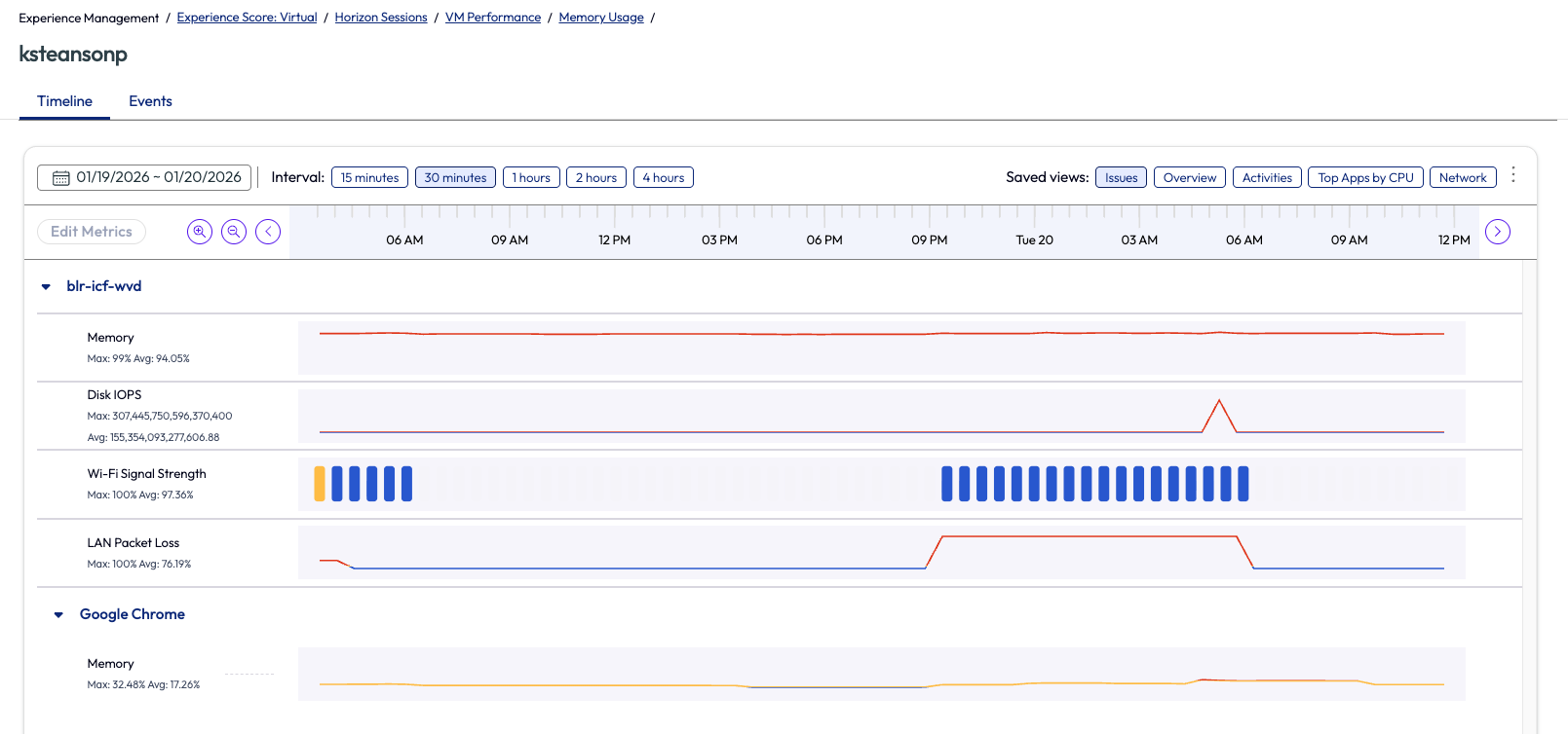
Figure 38: Memory usage for ksteansonp’s session, in timeline view
The admin is not technically responsible for the server management or, in their case, not even VM management. However, they have been able to identify an issue for adjacent teams to investigate further but with proof of poor experience. This is more than just an email that tells another team something is wrong; this is proof via data to substantiate the claim. The admin went back to the previous page and selected the username with the top session from the list and began an investigation.
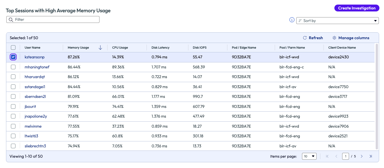
Figure 39: List of top users with VM sessions that had high average memory usage, sorted in descending order
After naming the investigation, the admin searched the list of available playbooks that might be helpful to this issue. After creating the investigation, they were able to share it with the appropriate Horizon team to investigate and remedy. The admin did this so they could keep an eye on the investigation and see how it correlates to the experience score once the issue was resolved. While this use case doesn’t show an immediate remedy to the found issue, it does show how the available data in the Experience Management tool helps identify issues and how it can be passed to adjacent teams for remediation. Also note, in the previous screenshot, Figure 6, multiple or all sessions can be selected to investigate a large-scale issue.
Use case 2: OS crash notification and automated running of script
The impact an OS crash can have on an individual’s work is obvious. When the OS crash is not just local to a single user’s device, but rather is widespread, the impact is amplified. If an organization is experiencing widespread OS crashes, then not much else will take priority over this issue. Omnissa Intelligence can help recognize OS crashes and alert admins when it happens at a rate above a set threshold, which helps proactively address, and possibly prevent, a widespread OS crash event.
In this use case, an organization is in this exact scenario. An admin received an email about an OS crash, which is not terribly abnormal when managing 20k devices. However, when a 2nd and 3rd email on the same topic come in within a one minute, the admin’s blood pressure began to spike. Thankfully in the first week, the admin used the Marketplace to find and set up a dashboard named OS Crash for Windows. Now the admin can navigate directly to Dashboards and search for the name and open the dashboard.
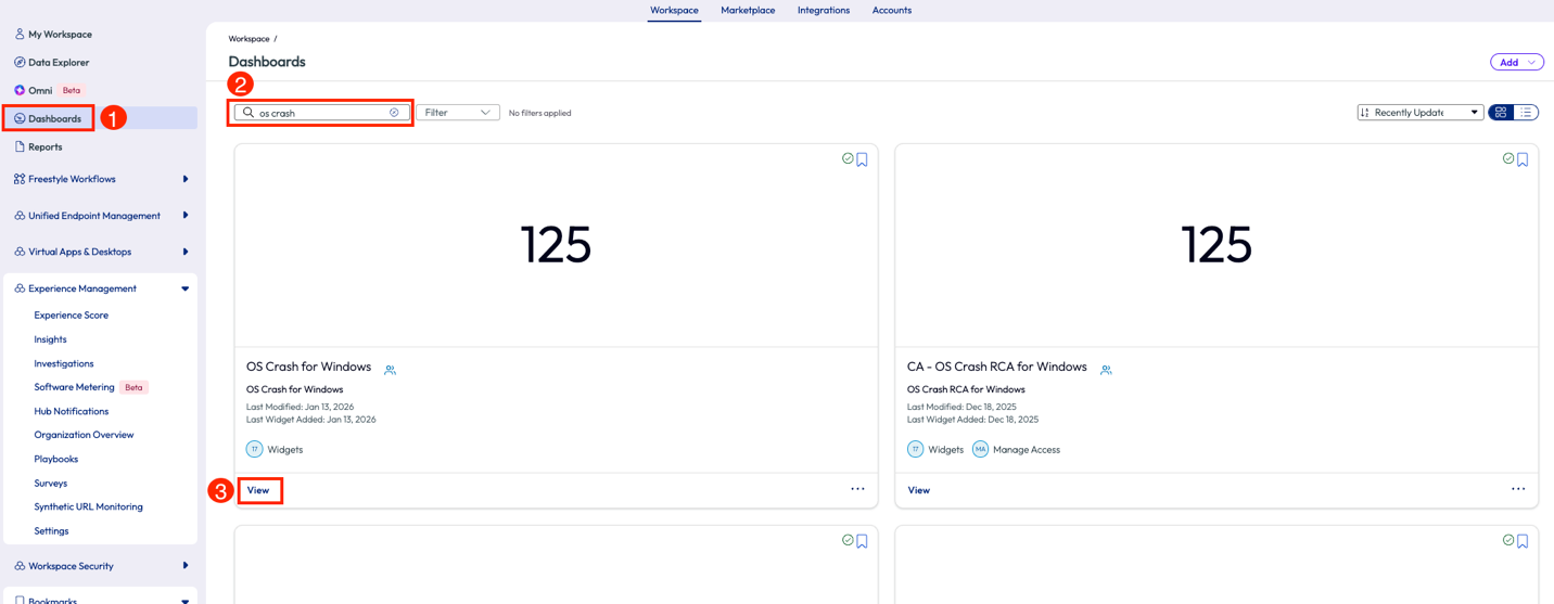
Figure 40: Search results for a user’s dashboards
Once inside the dashboard, the admin first changed the date range in the top right drop-down menu and selects “Last 7 days.” Next, the admin checked the first widget to see the count of OS crashes for the day and compared them to the last 7 days. It was apparent that the number of OS crashes was not significantly higher than other recent days, which means that the emails that came in were coincidentally close together in timing only. It did not appear to be a widespread issue at this moment.
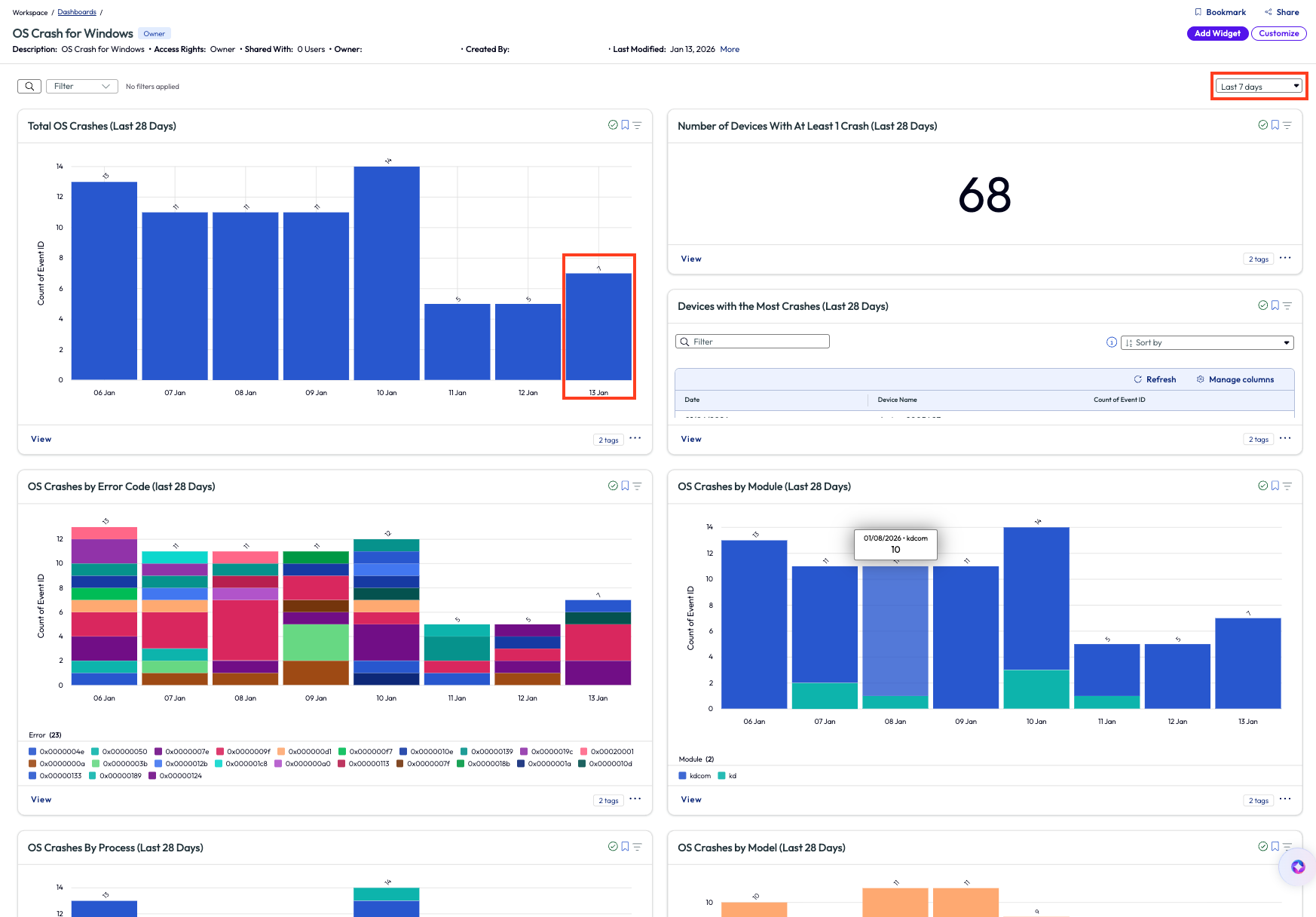
Figure 41: OS Crash for Windows dashboard
To reduce missed sleep that night, the admin decided to set up an alert triggered by increased OS crashes so that if in the event there was a widespread issue, then the admin would know by receiving the appropriate alert. Inside the widget, the admin selected the automate feature in the top right corner, which opened a new workflow. First, the admin named the automation and added a filter to only display devices that had synced within the last 24 hours.
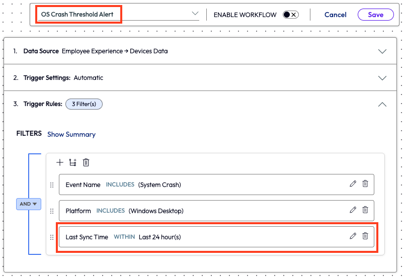
Figure 42: Naming and selecting filters for a new workflow
Next, the admin added an action to the workflow. They selected the type of action to take, which was to use Workspace ONE Intelligence to send an email with the required fields completed.
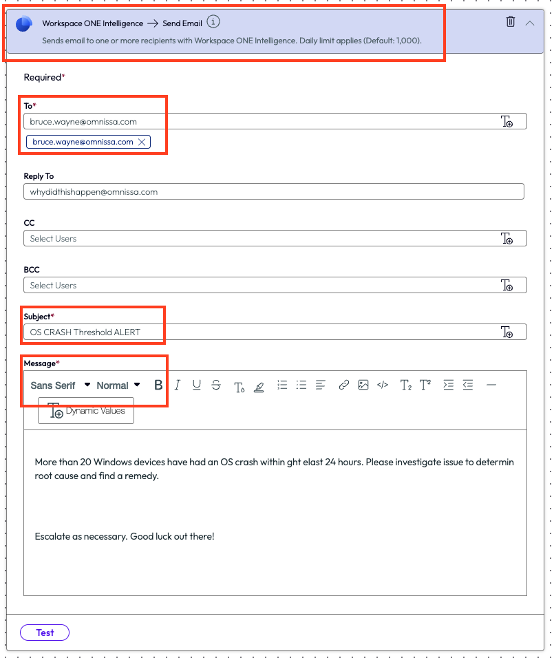
Figure 43: Parameters for an email notification configured inside a workflow
The admin now had a workflow set up to notify their team when OS crashes were occurring on devices that had synced in the last 24 hours. The next day, the Tier 2 support team found that certain devices were missing an important driver update, and this was the root cause of the issue.
After opening the recently created workflow to edit it, they used the plus sign to add an action step. In this case, the admin added a Run Script action and set it up to check for driver updates.
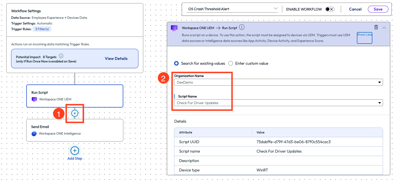
Figure 44: Adding an action step, Run Script, to an existing workflow
By simply adding this step to the workflow, the system now identified devices that had recently crashed, checked for missing driver updates, and then sent an email to the support team to notify that this workflow had been completed. This automation took two manual steps out of the teams’ process by no longer requiring manual monitoring of OS crashes and checking for missing driver updates. Furthermore, this workflow could also be expanded to check for other conditions and run additional scripts. The ROI here is the time and effort saved by having an automated process built based on OS crash data that impacted the experience of users and reducing impact to productivity.
Use case 3: App crash notification and automated remedy
This use case will sound similar to the previous scenario, but this organization came to their remedy in a different way. An admin was checking the experience score at their organization and investigated apps that have a high crash rate. This company was a predominately Windows environment, so the admin pulled up the Experience Score and clicked on Desktop Apps. After sorting the list of results by total app crash count, highlighted in pink in Figure 12, they noticed that the Lenovo SmartNote app had an exceptional amount of app crashes, almost 5k in the last 4 hours.
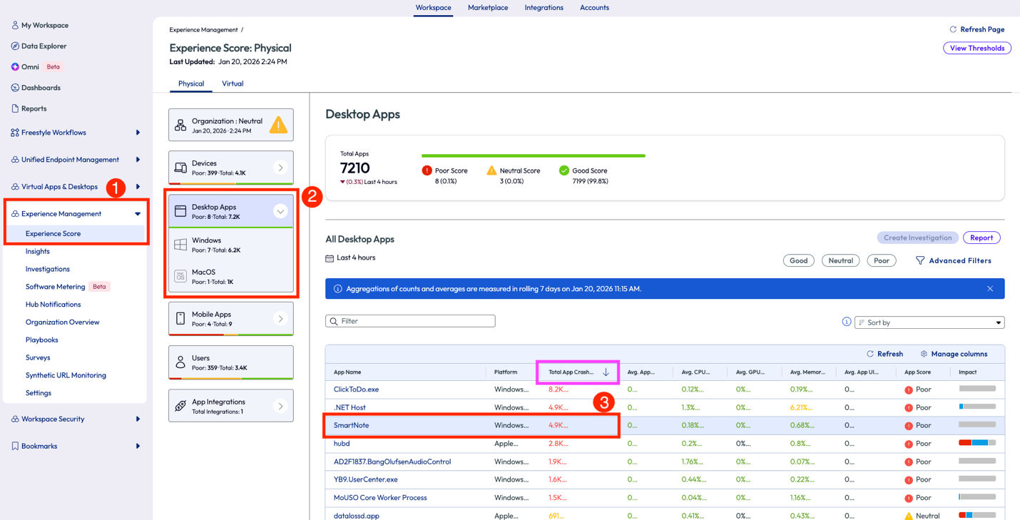
Figure 45: Experience Score for Desktop Apps sorted byTotal App Crash Count
The admin realized on this page that 73% of this app version had poor sessions. They then clicked into the app to dig deeper.
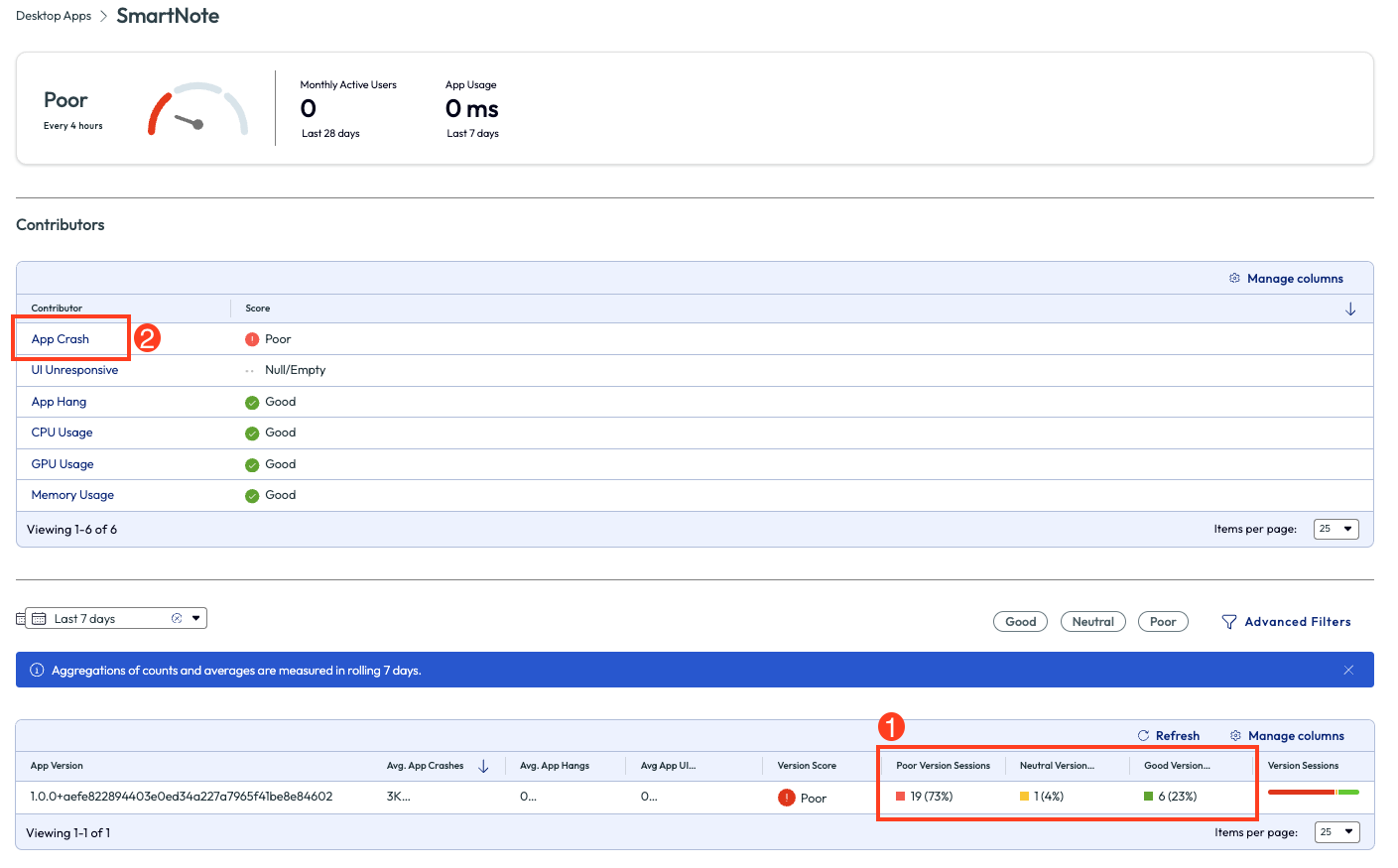
Figure 46: SmartNote app experience score page with list of contributors
On the app crash page, the first metric that stood out was the almost 5k crashes in question all happened on one device. The chart shows this data broken down by day over the past 7 days, in which it is evident that this version had an issue for two days in the past week.
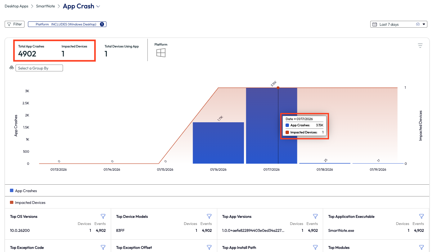
Figure 47: App crash metrics over past 7 days for SmartNote
Lower on this page is a list of the impacted devices or, in this case, device. By selecting the device on this page, the admin was able to run a QuickFlow. They selected a QuickFlow specific to app crashes that tells the device to look for updates for specific business-critical apps. This script was created in-house and already uploaded to Workspace ONE UEM for use.
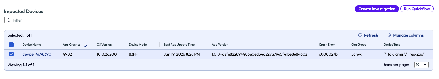
Figure 48: Selecting a device from the list in order to run a Quickflow
Use case 2 ended with an automation with conditions and actions, however this use case was resolved with a company-built script specific to the enterprise apps that often need updates. This scenario started with a curiosity around app performance in the deployment and ended with solving a specific need for an individual user. This was not a widespread issue, but it does demonstrate how monitoring the experience of devices and users will result in ROI for the organization.
Use case 4: Zoom Quality of Service (QoS) and cache clearing
Communication within an organization can make or break a day, sprint, or project. It is widely agreed upon in the tech world that communication must be available and as close to flawless as possible to not lose precious time or money. With modern work teams being spaced out over regions, Zoom is a great tool to help stay in sync amongst teams. When there are poor experiences with a communication tool like this one, it is costly and unproductive. Omnissa is helping to identify some of these root issues with a feature that looks at the QoS of Zoom.
In this use case, the admin went to the Experience Management section on the left to investigate how the Zoom calls were performing in the environment. Under the App Integrations there is an option for Zoom. After clicking on this, there is a full page of worthy metrics to show how the app has been performing. This made anomalies easy to spot and investigate. Overall, the Zoom app had been performing well for most users. There were 11 users who had had a poor meeting and 1 user with a bad meeting experience. The admin clicked on the Screen Share Quality option to dig deeper into the users with bad and poor meeting experiences.
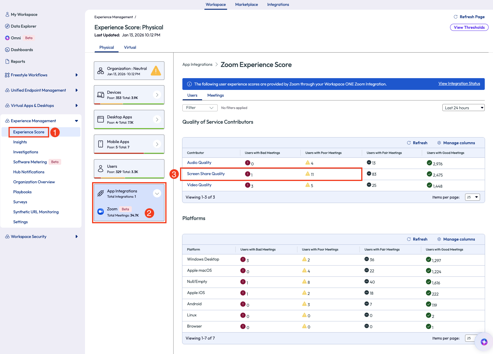
Figure 49: Experience Score for Zoom app integration
Inside the Screen Share Quality dashboard are a few widgets. The first widget displays the previous 7 days of screen share quality experiences. Since the admin wants to filter out the good and fair sessions, they select the poor and bad filters at the bottom of the chart.
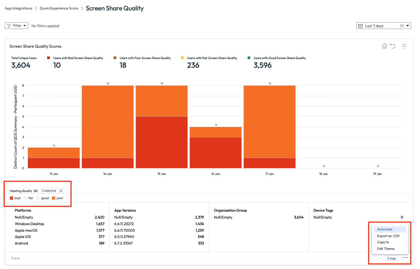
Figure 50: Screen Share Quality page for Zoom app, highlighting how to use the Automate feature
This action narrowed down the results to only show what is important to the admin. On the bottom right of the page, the admin clicked the menu icon to select from the options. After choosing Automate, they are taken to the familiar Freestyle Workflow page with the data source, trigger, and a few filters already selected.
The admin wanted to narrow down just a bit further, so they added in a couple more filters to ensure the workflow only targeted devices that had synced in the last 7 days and had a meeting quality experience of poor and bad.
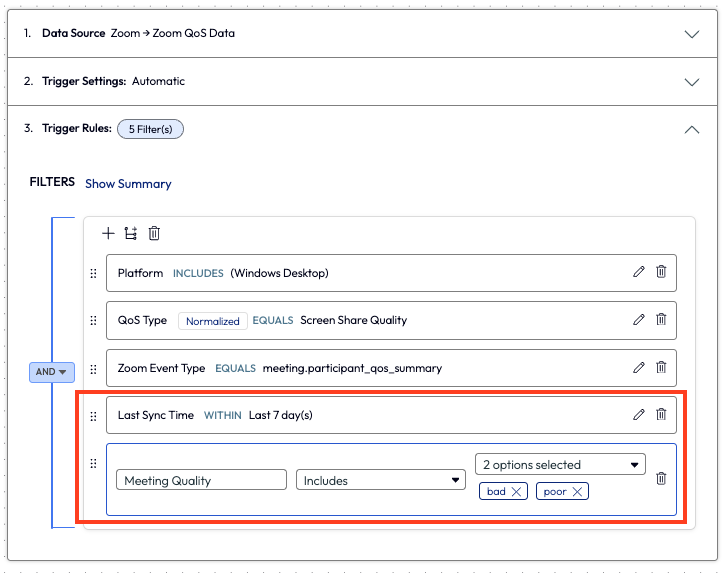
Figure 51: Adding a filter within a workflow to select only bad and poor statuses for Meeting Quality, and adding a filter for Last Sync Time within 7 days
Back in the workflow, the admin added a new action step to the flow. They added an action to run a script that clears the Zoom cache. This is a common step that the Tier 1 support team performs on a regular basis, which prior to this workflow was about 5-7 times per day on average. This was valuable time that the organization and the individual workers were spending to resolve a task that could be monitored and remedied automatically.
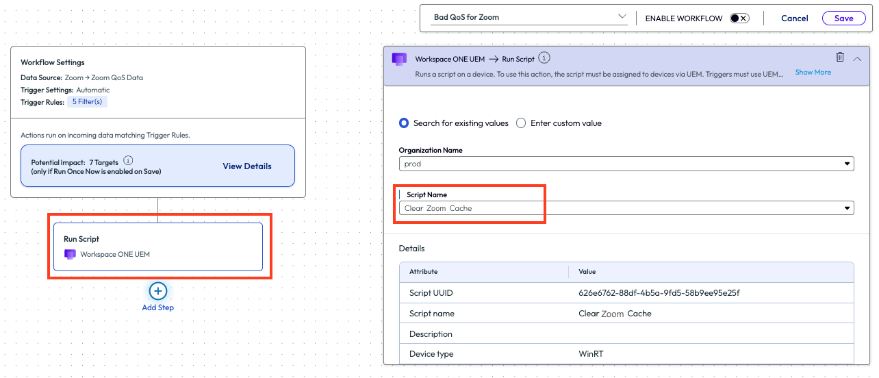
Figure 52: Adding a Run Script action to a workflow and selecting the desired script from the drop-down menu
After the admin deployed this script to their environment, they saw a drop to nearly 0 bad experiences and only a few poor experiences for the Zoom app. This is an obvious ROI of time and money and it’s easy to set up in any environment.
Use case 5: Networks with weakest Wi-Fi connectivity and identifying corporate devices on non-corporate Wi-Fi
In this next use case, an admin that worked at a company headquarters was getting complaints about the Wi-Fi speed during the company’s on-site sales kickoff meeting. The admin started by looking at the Experience Score for desktops and found that a poor Wi-Fi signal strength was impacting 685 devices. This would account for the large number of people on-site for the event, but still the admin wanted to investigate the devices with this poor experience and tried to find a commonality.
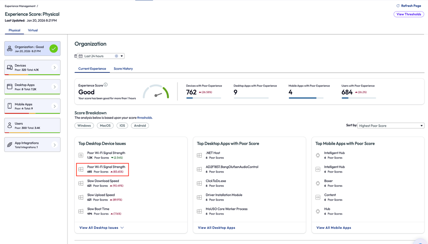
Figure 53: Experience score for an organization, highlighting Poor Wi-Fi Signal Strength
On the Signal Strength page, the admin noticed that 1.77k devices had a signal strength of 20-40%, which would lead to the conclusion these devices were the ones experiencing the issue. The admin knew that the sales kickoff event was internal only and did not include any outside customers or vendors, however, they noticed that 45 desktops were connected to the “omnissaguest” network (renamed for anonymity).
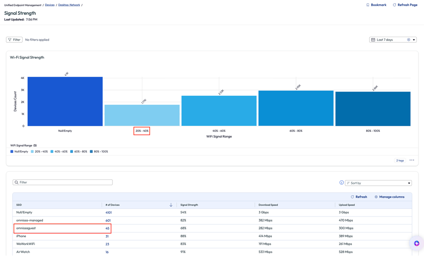
Figure 54: Signal Strength page for Wi-Fi, highlighting poor connection strength and network in question
Before digging deeper on the 45 devices, the admin scrolled down on the page to view more related widgets that gave insight to the protocol, frequency, and OS version of the devices connected to the various networks.
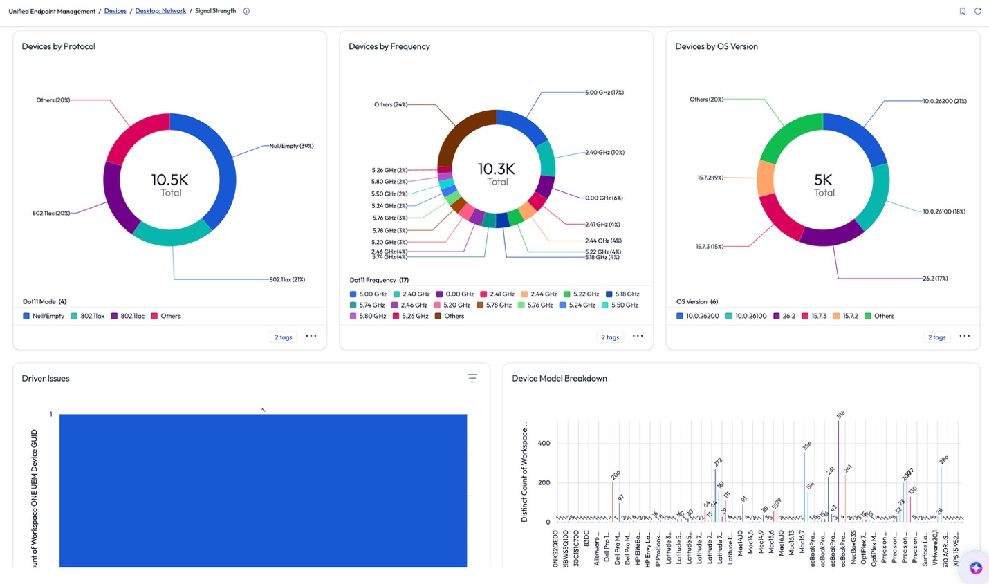
Figure 55: More metrics from the Signal Strength page
Next, the admin clicked into the 45 devices to dig a bit deeper. On the omnissaguest signal strength page, the admin discovered a list of 31 devices connected to this network that are corporate devices. The network at the office is certificate based for connection and all corporate devices should have the connection automatically.
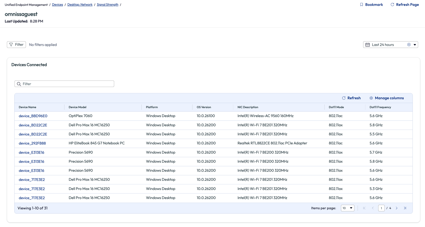
Figure 56: List of devices connected to “omnissaguest” network and related metrics
The admin spot-checked a few devices from this list to find that they were missing the correct profile from Workspace ONE UEM that would deploy the Wi-Fi certificate to their devices. To ensure that all colleagues had the correct profile, the admin decided to re-push the profile to all corporate devices. This was a quick turn around and all 31 devices that were connected to the guest Wi-Fi were resolved as soon as the devices received the profile. Another benefit was that all the devices that already had the correct certificate received a renewed certificate date.
Next the admin created a workflow, like in previous use cases of this article, and had this specific profile pushed to devices every 180 days. This would ensure that devices had a semi-annual update of the certificate even though the certificate was valid for 365 days. The following year there were no reported issues of slow Wi-Fi connections during the sales kickoff event at the corporate headquarters.
This use case is an internal facing example of quickly identifying devices with poor Wi-Fi connections and the ability to deploy a prompt resolution. To remedy these devices in such short order shows the power of Experience Management when used in conjunction with Workspace ONE UEM.
Use case 6: Identifying devices with continuously high CPU temperature
Many organizations are faced with this next use case but may not have visibility or a quick remedy. When devices use an excessive amount of a resource it can lead to poor performance. As we’ve seen when memory is above average in a previous use case, high resource usage leads to slow device performance. When a CPU runs at a high percentage of its processing power for an extended time, this will also lead to poor performance, but it will also create a high physical temperature for the device. Since most of the workforce is using laptops, this heat can impact other hardware components and their lifespan, especially battery health.
In this use case, the admin assumed this was happening in the environment across different devices but didn’t have a way to prove it or to assess the cause in order to work towards a remedy. Inside the Marketplace, there is a pre-built dashboard named DEX Getting Started – Proactive Maintenance 2 that illuminated this specific issue to the admin. After adding it to their workspace, the admin was browsing the widgets and found one named Devices with Most CPU Temp Spikes > 90 C (194 Deg) (last 28 days).
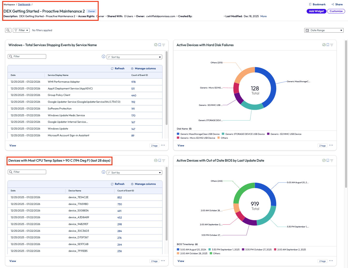
Figure 57: DEX Getting Started – Proactive Maintenance 2 dashboard with specific widget highlighted
The admin clicked to view more metrics around this issue and found the list of impacted devices on the bottom half of the page. They noted that in the top right of the page they could change the parameter to a different temperature but decided that 90 C was an appropriate amount to start investigating. Next, the admin looked closer at the columns on the list, noticing one named Thermal Zone Information Zone Temperature. The results in this column showed multiple devices operating well above the 90 C mark.
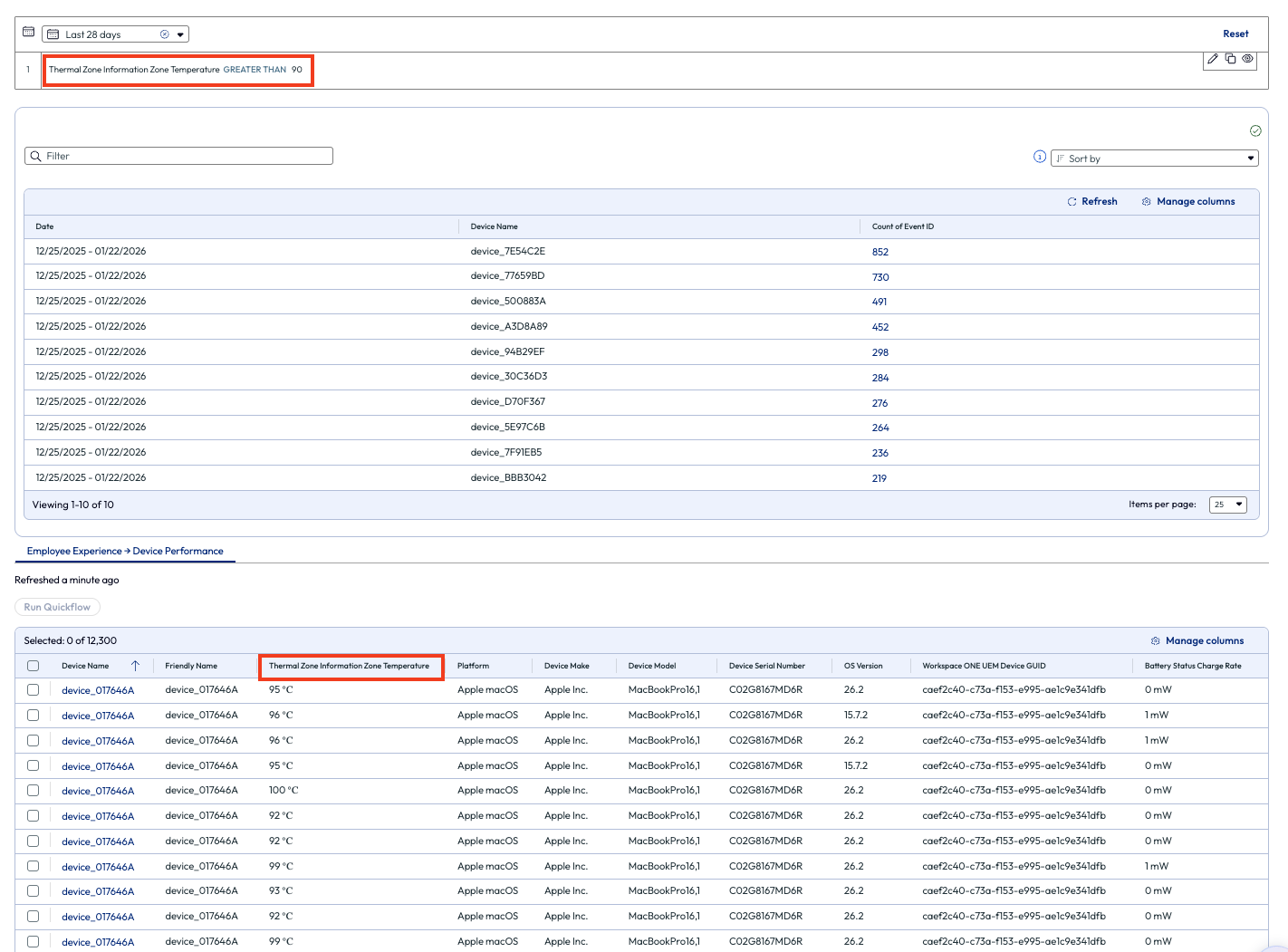
Figure 58: Devices with higher than 90 degrees Celsius thermal zone
The admin also looked at the column that lists the OS version of these devices. They noticed that the first few devices had older versions installed.
Figure 59: Selected devices from list, highlighting OS Version
Wondering if OS could be the cause of the processor not performing optimally, they selected the devices and decided to run a Quickflow. The admin searched for a recently added Quickflow named macOS Enforce Tahoe Update and sent the execute command to these devices.
Over the next 24 hours, the admin monitored these devices and found that their CPU usage dropped significantly once the OS had been upgraded. This shows the value of a single widget found on a single dashboard for one admin’s environment. The admin then went back to the proactive maintenance dashboard and looked for other areas to find quick ROI by leveraging visibility into experience metrics via the Experience Management dashboards.
Use case 7: Using Insights to address anomalies in an environment
Using the Omnissa Intelligence data lake, awareness is possible, even for metrics that admins don’t think about daily. There is an old idiom that states “if you don’t know what you’re looking for, you’ll never find it.” Omnissa intends to help prove this statement false by anomaly detection and proactive alerting across the deployment made possible by Insights. Note that there is no minimum requirement for number of devices or number of apps for Insights to work in an environment.
Insights bring anomalies in an environment to the front of mind by producing a notification when a metric exceeds a normal parameter. In this use case, the admin received a notification while working in Omnissa Intelligence that informed them of an increase of Zoom app crashes. Since Zoom is a business-critical application, this caught the admin’s attention quickly.
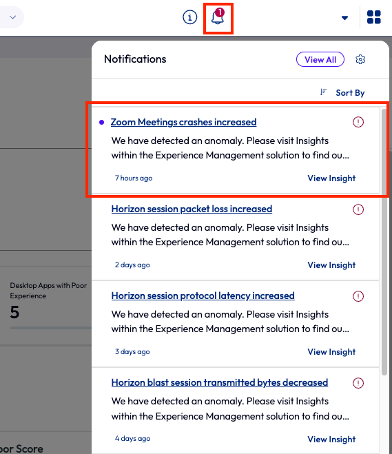
Figure 60: Omnissa Intelligence notifications with Zoom Meetings crashes increased highlighted
There is also an Insights page that lists all Insights. This is a good place to revisit and track insights over time. On this page, Insights can be sorted by Newest or Most Impacted Devices to help organizations put them in order by what is more valuable to a specific organization. In this case, the admin just wanted to see the most recent Insights.
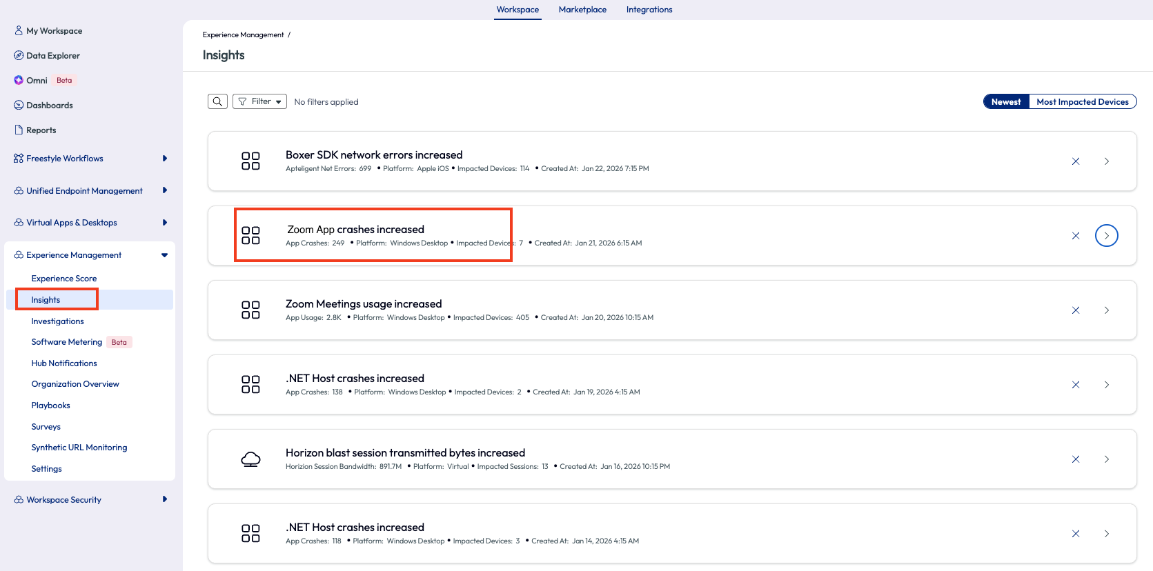
Figure 61: Insights page with Zoom App crashes increased highlighted
The admin clicked the arrow on the right side to expand this specific Insight and scrolled down slightly to find an app usage chart. This timeline chart made it quick to identify when the app crash increase occurred in the environment. As it turned out, the environment had been experiencing these crashes over the past 7 days, but the Experience Management tool had not yet been enabled.
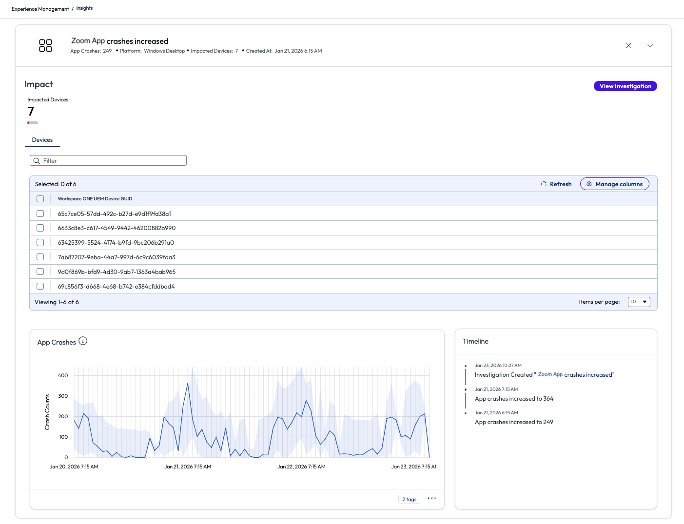
Figure 62: Zoom App crashes increased insight expanded to show devices and metrics
From here, the admin wanted to investigate a possible root cause of this increase. At the top of the page, the admin used the search bar to find the Zoom app under the DEX results.
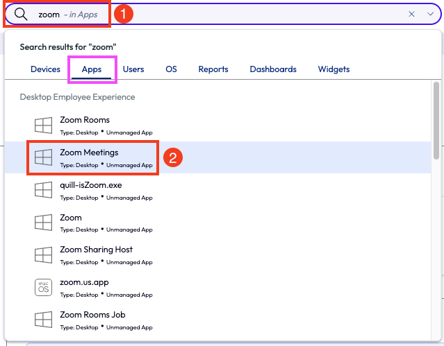
Figure 63: Environment search for “Zoom” with “Zoom Meetings” highlighted
On the list of contributors was the obvious App Crash. Before clicking into the highlighted contributor, the admin scrolled down to see more metrics and a break down list of app versions and scoring per version, as seen in Figure 31.
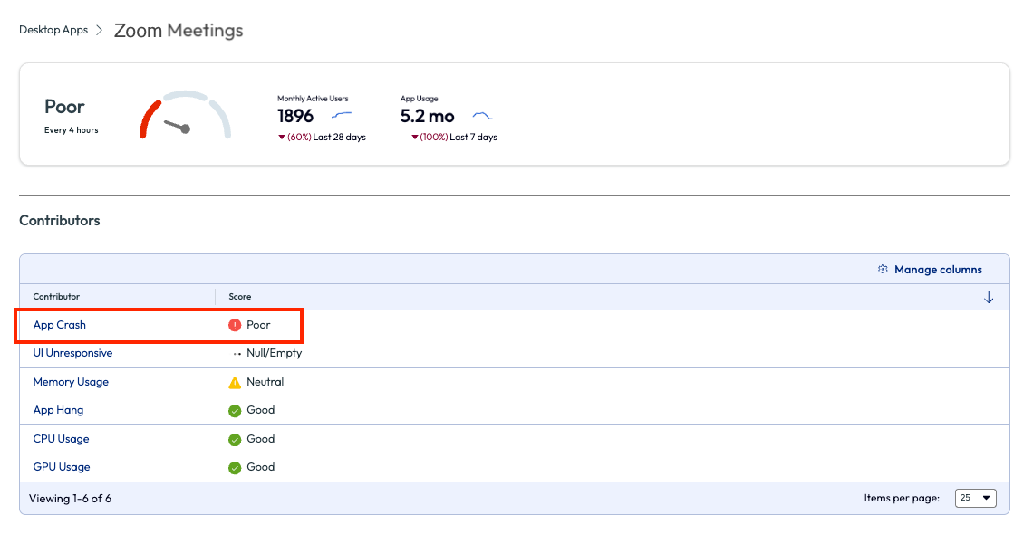
Figure 64: Experience score page for Zoom Meetings with list of contributors
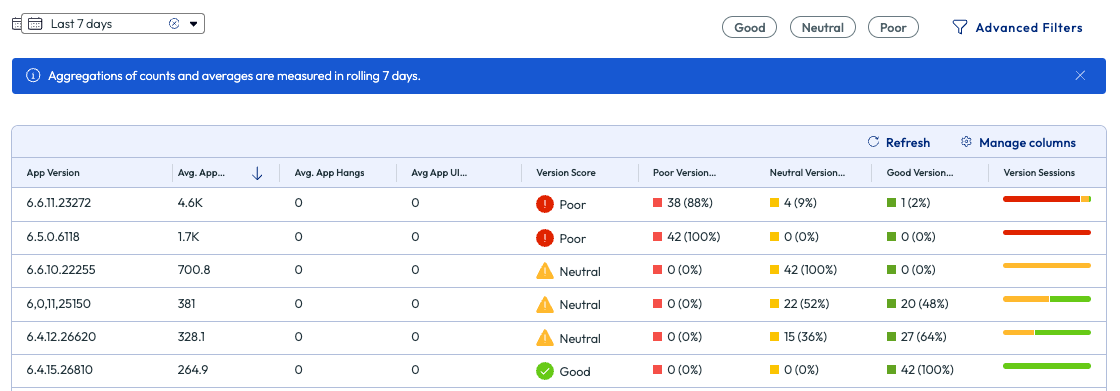
Figure 65: More metrics on the Experience Score page for Zoom Meetings
The admin first changes the date range to see trending data around this issue, mainly to identify if it had been an ongoing issue or just a recent uptrend in app crashes. Next, the admin looked at the top exception codes to see if there was an anomaly. The code 0X80000003 stood out with a large amount of app crashes.
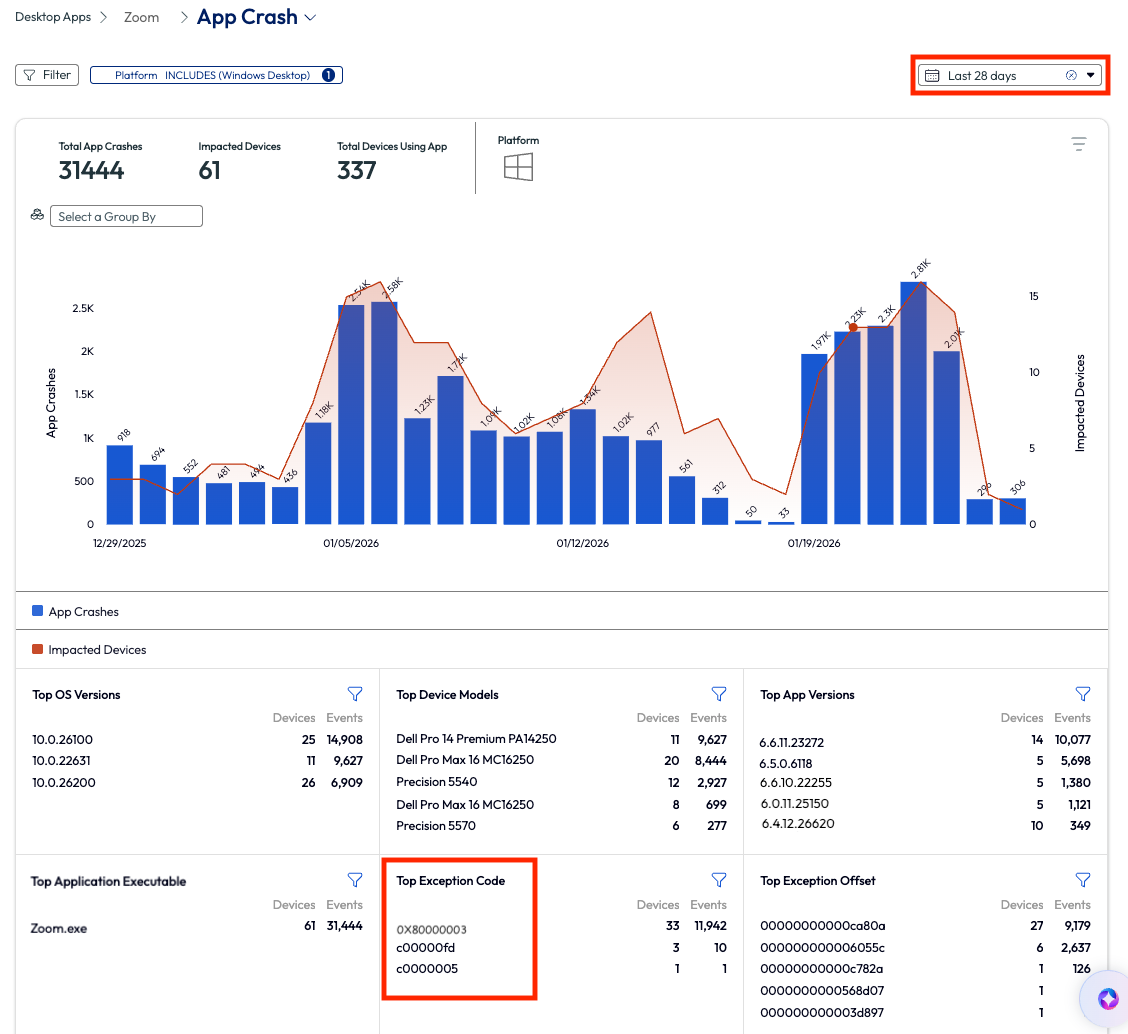
Figure 66: App crash page for Zoom Meetings, highlighting Top Exception Code, filtered by Last 28 days
The admin searched this code in a browser to find it is the exception code thrown when Zoom hits an unexpected internal state and triggers a software breakpoint. This error is most commonly caused by a faulty or incompatible Zoom module, and the fix was a simple patch that was included in the more recent version of the app. Knowing this, the admin then downloaded the latest version of the enterprise Zoom app, tested it, and deployed it via Workspace ONE UEM. After the upgrade, the Zoom app ceased to crash, and the organization had been cured of this crashing plague.
Before wrapping up this use case, there is another helpful feature that the admin used for troubleshooting, which was to investigate the breadcrumbs around the time of the crash. The admin pulled up a single device with a known crash in the search bar, went to the timeline view of that device and filtered for crashes. The admin found a crash event and clicked on it.
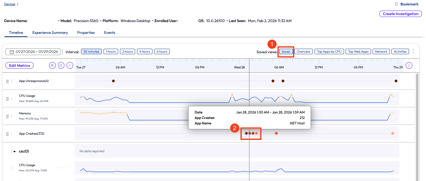
Figure 67: Timeline view of a device with app crashes highlighted, timeline is filtered with Issues only.
After clicking on the crash event from the timeline view, a window popped up with each crash, and they were expandable for more detailed information. The list of breadcrumbs shows which app failed and other system events that happened near or at the same time. This helped the admin draw conclusions about the root cause of the app crash.
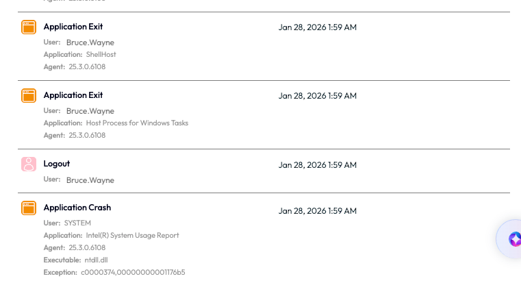
Figure 68: Logged breadcrumbs for an application crash on a device with other surround events
To summarize this use case – the Experience Management feature, Insights, alerted an admin of an anomaly that the Zoom app crashes had increased. The admin investigated via the DEX app metrics to determine the impact, found the root cause exception code, then researched the reason for the exception code and most common fixes. Finally, the admin downloaded, tested, and deployed a newer version of the Zoom app and the issue was resolved.
This use case took a hybrid work company from crippled to back up and communicating within a relatively short period of time. While the ROI on this use case may not have a dollar sign attached, it does have a clearly recognized value in using this tool to monitor anomaly experiences in an environment.
Week 2 Wrap up
With these additional use cases for week 2, the hope is that even more value is realized in the product. The Experience Management toolset has so much to offer that the ROI should be evident at this point. From CPU to memory issues and app crashes to Horizon connection metrics, having visibility into an environment at this level proves the case for ownership.
Stay tuned for the Week 3 section where even more use cases will be discussed that show the power of Workspace ONE Experience Management.
Week 3: Coming soon
Summary and additional resources
With all these use cases, what are the limits? From the low hanging fruit in the first week to using some strategic features for focused outcomes a month into the product, Experience Management helps to gain that, often non-tangible, ROI. Our hope is that this provides a good understanding of Experience Management inside Omnissa Intelligence and to inspire confidence using the product. Below are some additional resources to help with getting started and realizing the real-world value of Experience Management.
Additional resources
To learn more about the Workspace ONE Experience Management solution, explore the following resources:
Getting Started with Workspace ONE Experience Management
Omnissa Workspace ONE Experience Management
Omnissa Intelligence Dashboards, Workflows, and Reports
Omnissa Intelligence Quickflows
Automate Endpoint Configurations with Scripts
Automate Endpoint Configurations with Scripts for macOS Devices
Author and contributors
This document was written by:
- Cy Whitfield, Senior Product Specialist
Feedback
We value any and all feedback.
To comment on this paper, contact the Omnissa Product Specialist Team at tech_content_feedback@omnissa.com.