Creating visualization for device & application lifecycle with Workspace ONE Intelligence

Organizations are increasingly reliant on a diverse array of endpoints to execute essential business functions. A critical component of effective endpoint management is proactive monitoring. Key questions commonly faced during the deployment and management of devices include:
- What is the overall performance of our device fleet?
- Are we able to deploy business-critical applications to devices promptly?
- How many devices are at risk due to zero-day vulnerabilities?
- What is the status of specific issue remediation efforts?
While the Workspace ONE UEM console offers some reporting capabilities, these are often limited in scope and flexibility, containing only predefined columns. Enhancing these reports typically requires additional data manipulation, such as merging various reports, aggregating data, and creating visualizations. This process can be time-consuming for administrators, particularly when addressing potential security vulnerabilities.
Workspace ONE Intelligence dashboards
The Workspace ONE Intelligence Dashboards enable rapid creation of visual representations for device fleets. Users can aggregate data into preferred diagram formats, construct dashboards to communicate with business teams and leadership or diagnose and address unforeseen issues.
There are numerous built-in dashboards and templates available to facilitate initial setup, which can be accessed through the Workspace ONE Marketplace. An example of the built-in default Dashboard of Devices (Figure 1) and Apps (Figure 2) is shown below.
On the built-in Devices Dashboard, data from the current state of endpoints provide inventory-related information, including the number of active and inactive devices, device types, ownership, and device models. Additionally, it features historical data to help identify long-term trends and patterns of device lifecycle stages. For instance, the enrollment events widget displays trends in device onboarding, usage, and decommissioning. This information can greatly assist IT administrators in optimizing inventory management, improving forecasting, enhancing budget planning and increasing operational efficiency.
At the top of the Devices dashboard, there are two modules: the Mobile Devices Dashboard and the Desktop Devices Dashboard. These modules display health status data for their respective platforms. For more details, refer to Dashboards in the Omnissa documentation.
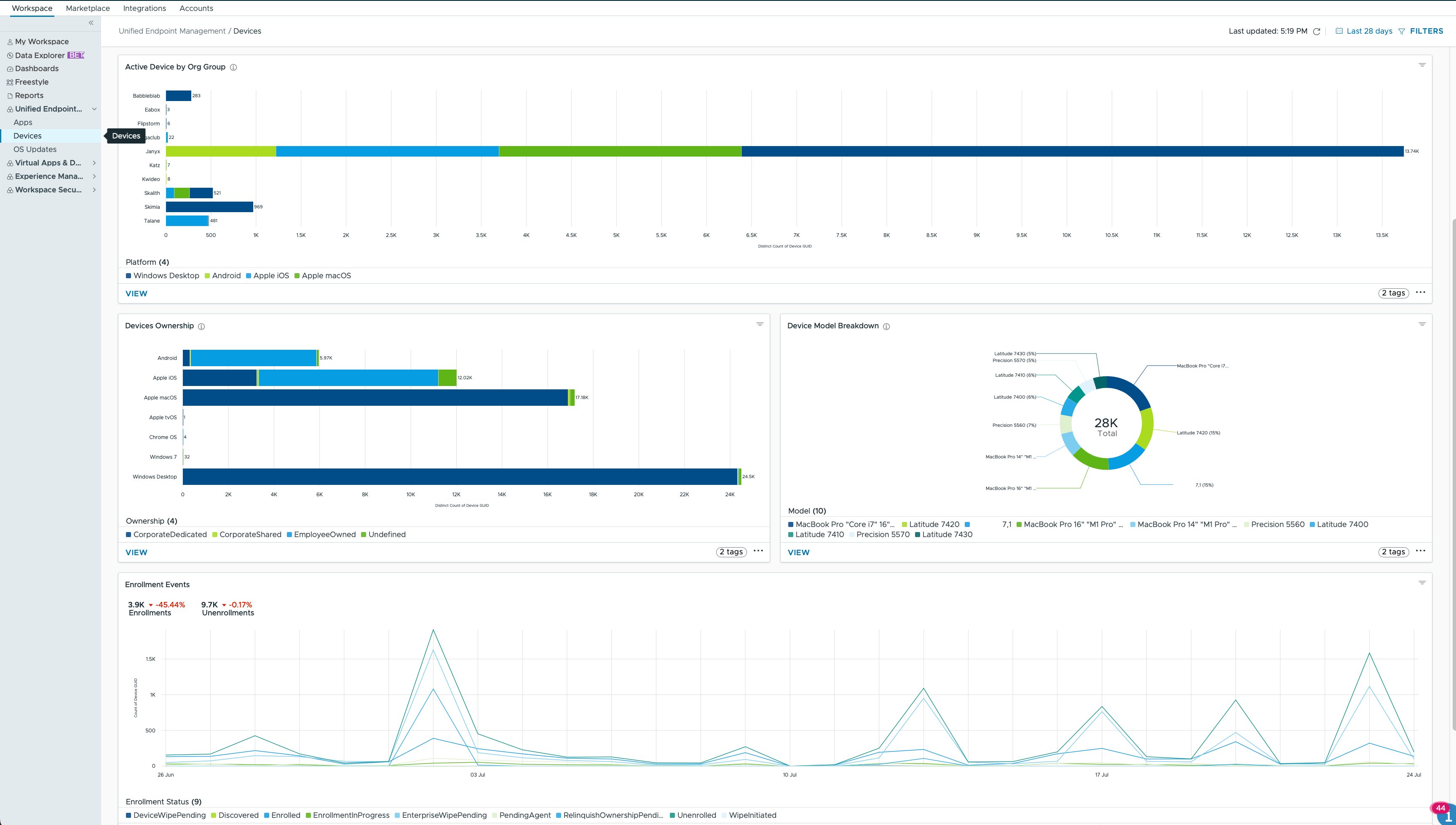
Figure 1: Partial built-in device management dashboard in Workspace ONE Intelligence
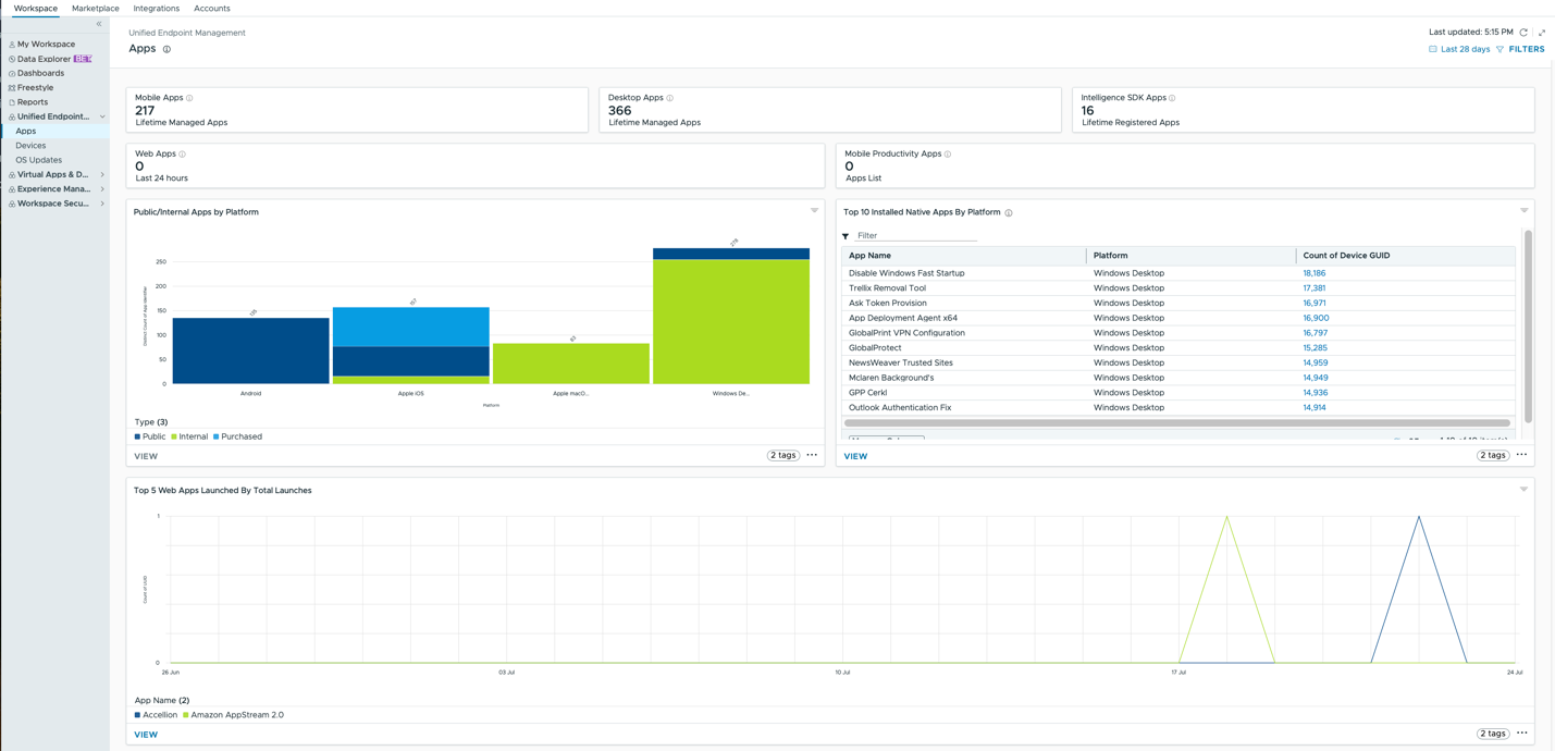
Figure 2: Partial built-in application management dashboard in Workspace ONE Intelligence
The Apps Dashboard provides the data for applications from Workspace ONE UEM, Workspace ONE Access and Intelligence SDK. It provides insights into which applications are frequently used and which are possibly neglected. This can help administrators optimize resource allocation, ensuring that popular applications receive adequate support and resources. For less used applications, administrators can assess whether they are still necessary, identify opportunities to reduce costs by eliminating unnecessary software licenses and subscriptions, or explore ways to improve the user experience.
Workspace ONE marketplace
The Workspace ONE Marketplace serves as a curated repository filled with a plethora of ready-to-use templates, including those for dashboards. These templates allow users to efficiently explore and visualize endpoint data, such as device inventory, battery health, end-user experience analytics, and risk indicators. With just one click, these dashboard templates can be previewed and implemented into your Workspace, where they can be further tailored to meet specific organizational needs.
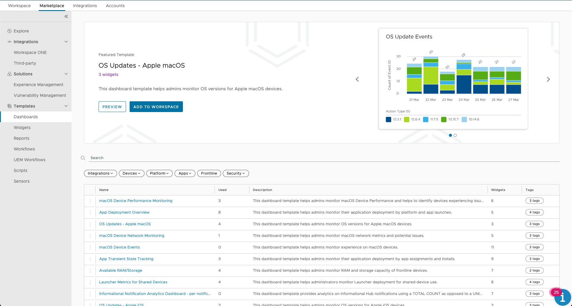
Figure 3: Dashboard templates in Workspace ONE marketplace
Follow the documentation to learn more about Workspace ONE Marketplace.
Several Marketplace templates can be utilized for Device & Application Lifecycle management. For example, the Dashboard for Device Refresh and End of Life (Figure 4) includes nine widgets that categorize devices by various attributes, such as OS and models, indicating which may be considered for refresh or decommissioning. The criteria are typically devices managed by UEM for more than two years with a last check-in date over 30 days ago. Figure 5 displays a segment of the Device Refresh and End of Life dashboard, providing an overview of devices that may require attention for replacement. After importing the dashboard template, you can customize it to fit your organization's needs. For instance, you might adjust the enrollment period to 4 years and the last check-in date to 40 days if your organization refreshes devices less frequently.
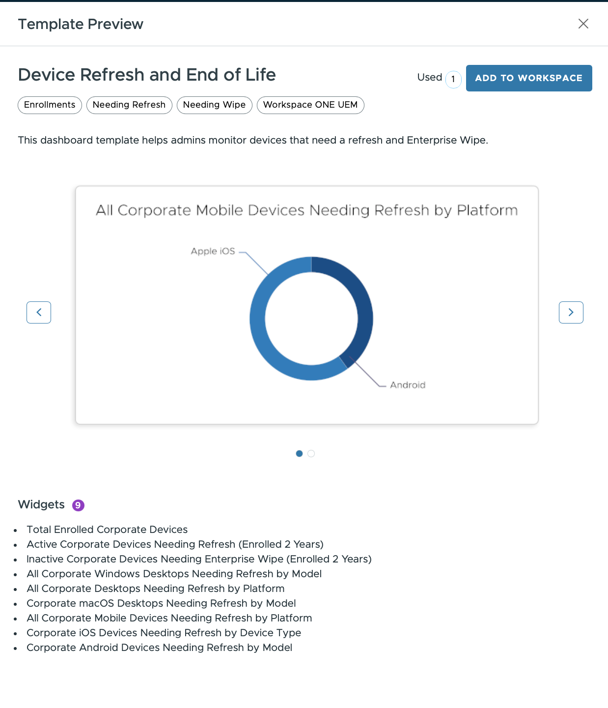
Figure 4: Dashboard template for device refresh and end of life
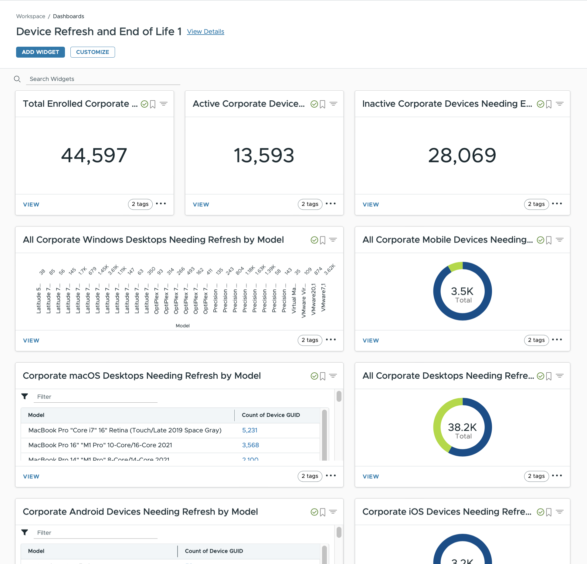
Figure 5: Partial dashboard of device refresh and end of life from marketplace
Another useful dashboard template for Device Lifecycle is macOS Device Performance Monitoring (Figure 6). This template includes 6 widgets that display historical data on macOS performance, such as CPU spikes, memory usage, CPU temperature, page file (virtual memory) usage, free disk space, and GPU 0 usage. These widgets show trends in macOS hardware performance over time. If the trend diagrams suggest that devices are being overworked, it may be time to consider hardware upgrades or device refreshes to maintain productivity.
Note: this dashboard requires licenses for Workspace ONE Experience analytics.
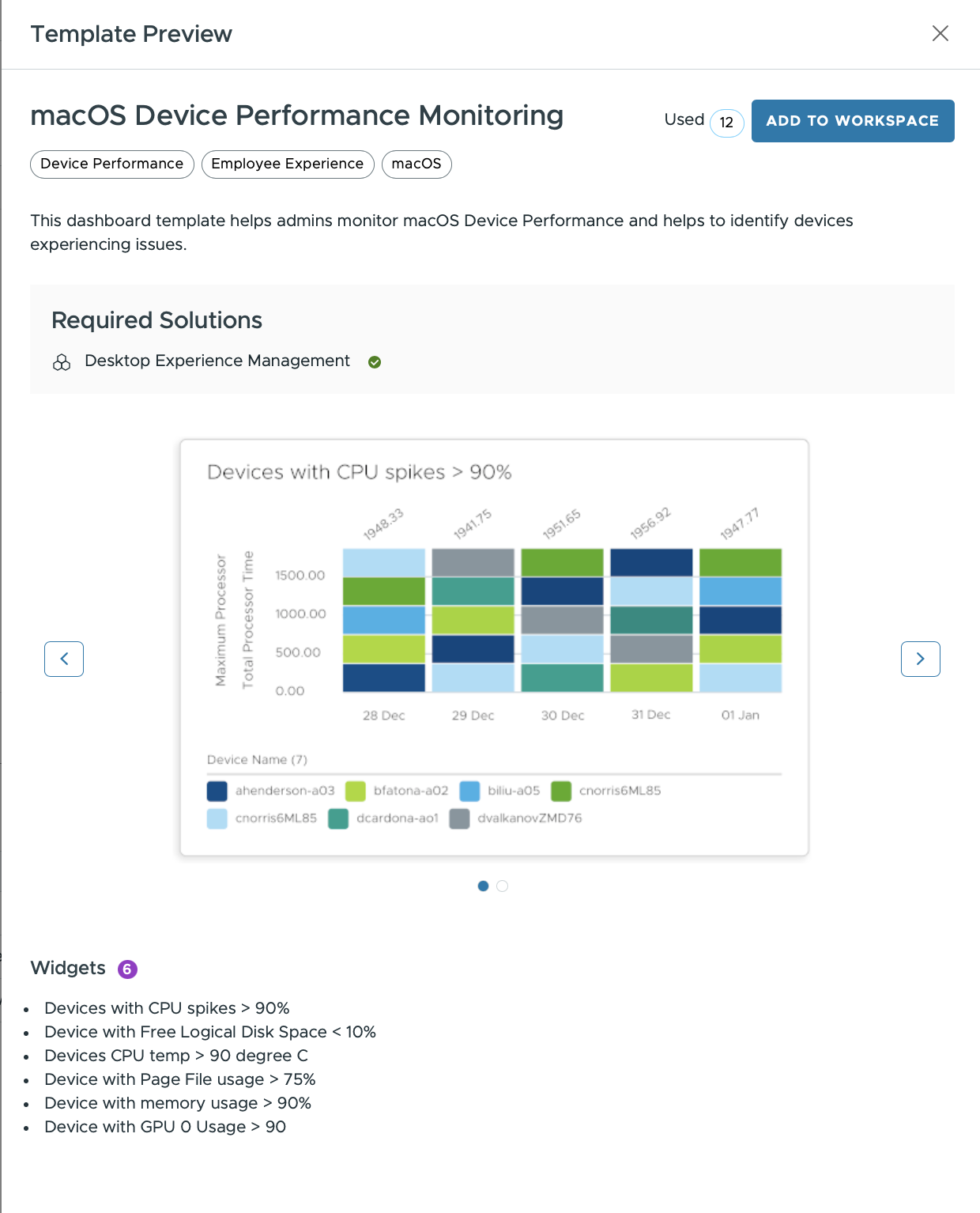
Figure 6: Dashboard template for macOS device performance monitoring
There are also several templates for application lifecycle management (Figure 7). These templates provide an overview of application deployments, installation and update statuses, application utilization, and more. Together, they offer comprehensive insights into the status and performance of applications across the organization.
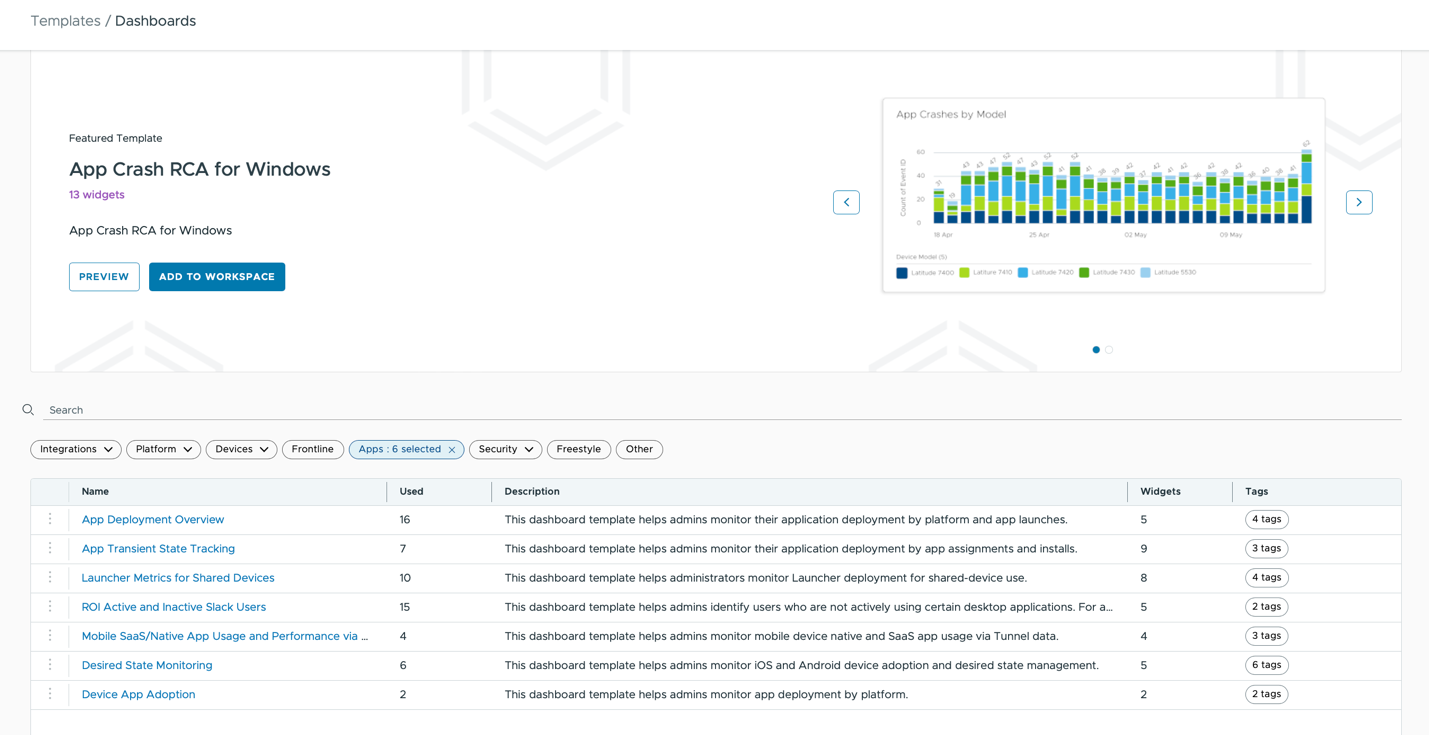
Figure 7: Dashboard templates for application adoption, performance and installation status
Custom dashboards
Beyond the predefined options, custom dashboards can be created to address unique organizational requirements. For instance, an overview of mobile devices with required security profiles (e.g., passcode and restrictions) can be visualized, including the device compromise status during active rollouts. This type of dashboard can include various widgets that display the installation and compliance status across different mobile platforms.
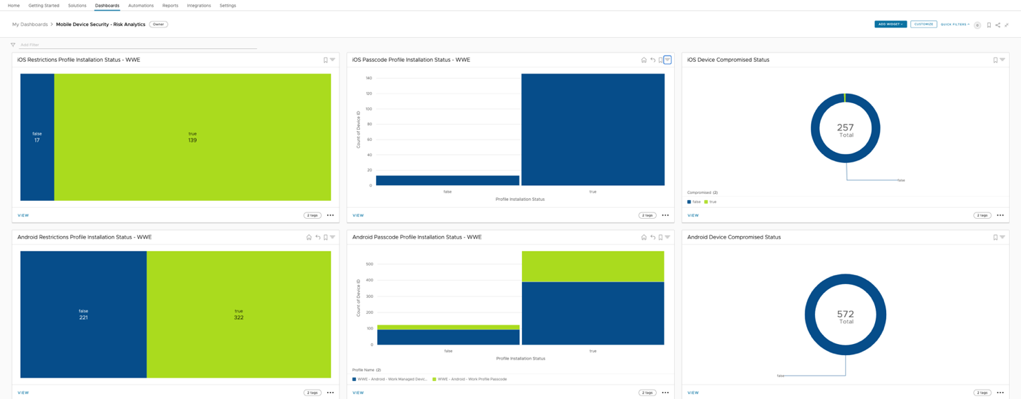
Figure 8: Custom dashboard tracking device compromised status and security profile installation
From such a dashboard (Figure 8), significant insights can be gleaned at a glance, such as the number of devices lacking a Restrictions Profile, prompting further investigation within the Workspace ONE UEM console.
Summary
In conclusion, Workspace ONE Intelligence offers powerful visualization tools that enable organizations to proactively monitor and manage devices and applications without compromising productivity. Marketplace templates provide a solid starting point for administrators to build their dashboards, which can be customized to meet the unique needs and requirements of the organization. Creating visual dashboards and widgets is just the beginning of device and application lifecycle management. Workspace ONE Intelligence also includes features like automations (discussed in the blog series on Intelligence use cases) to ensure that corporate devices and applications remain up-to-date.
